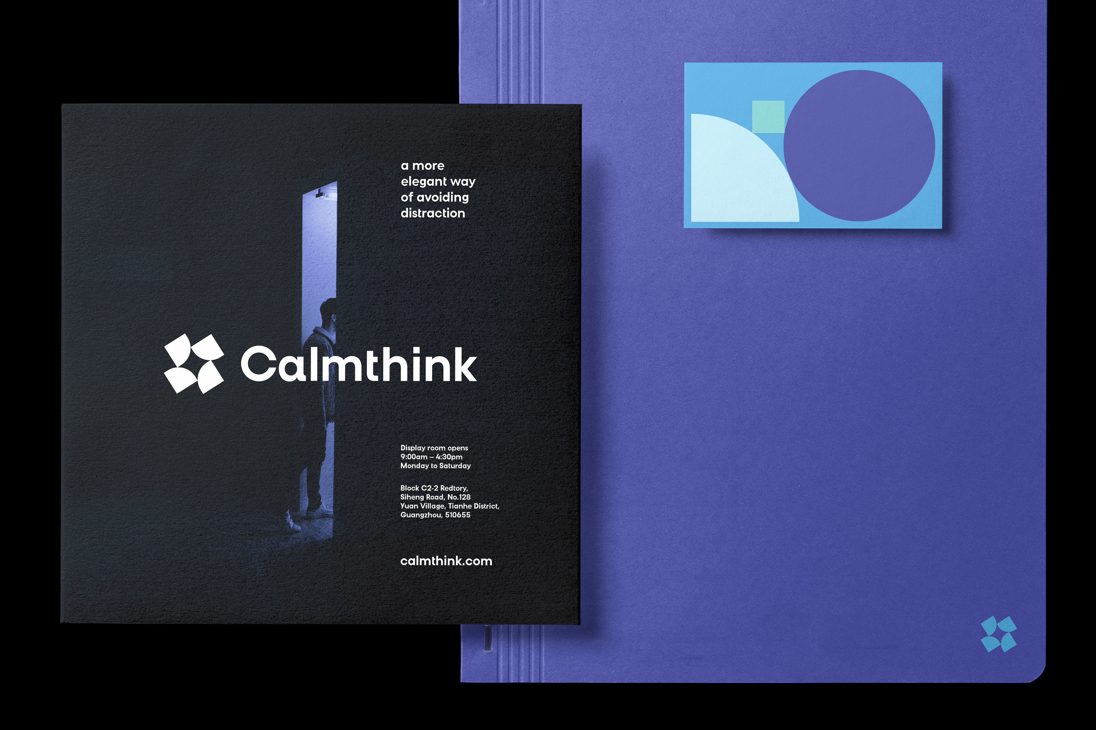
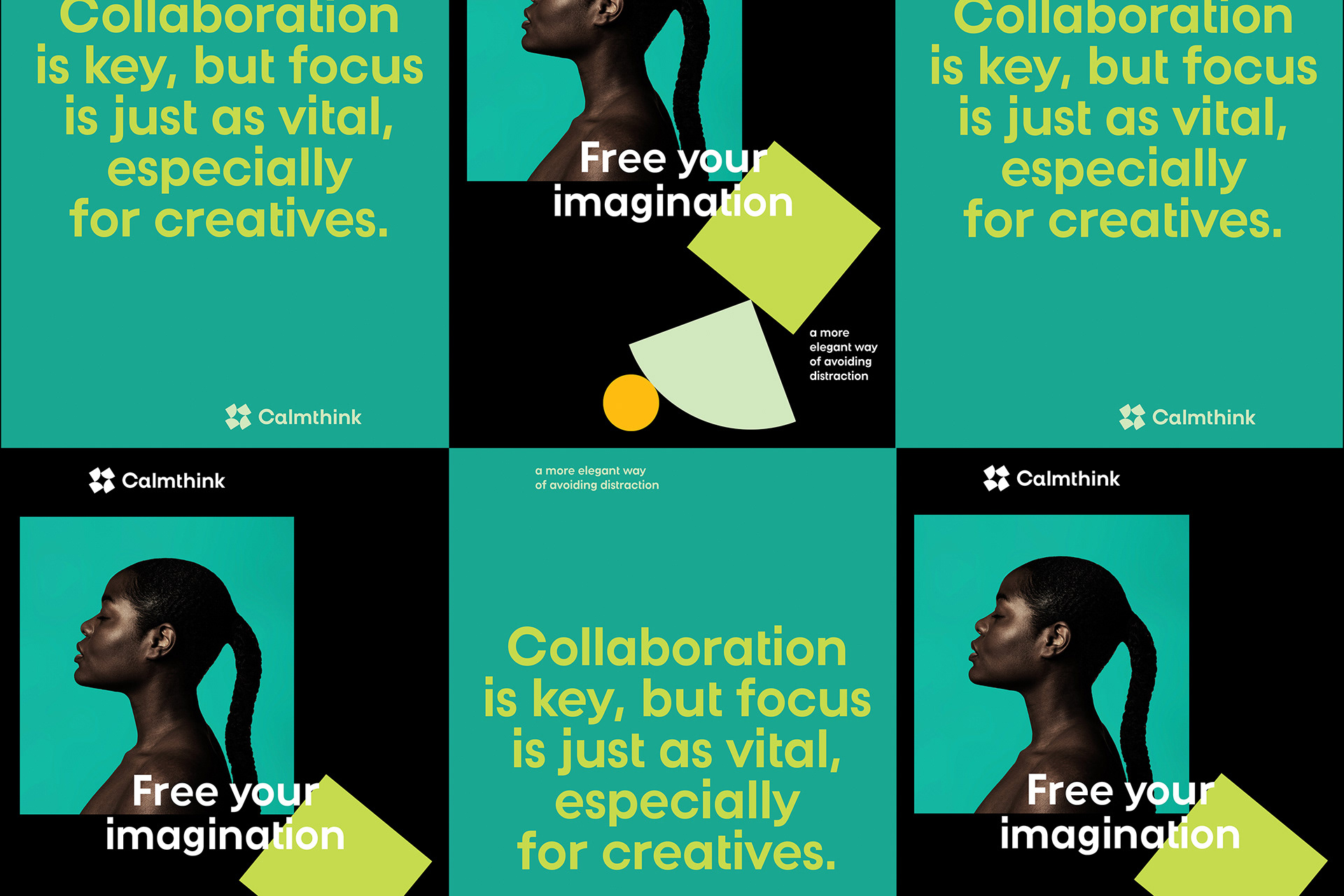
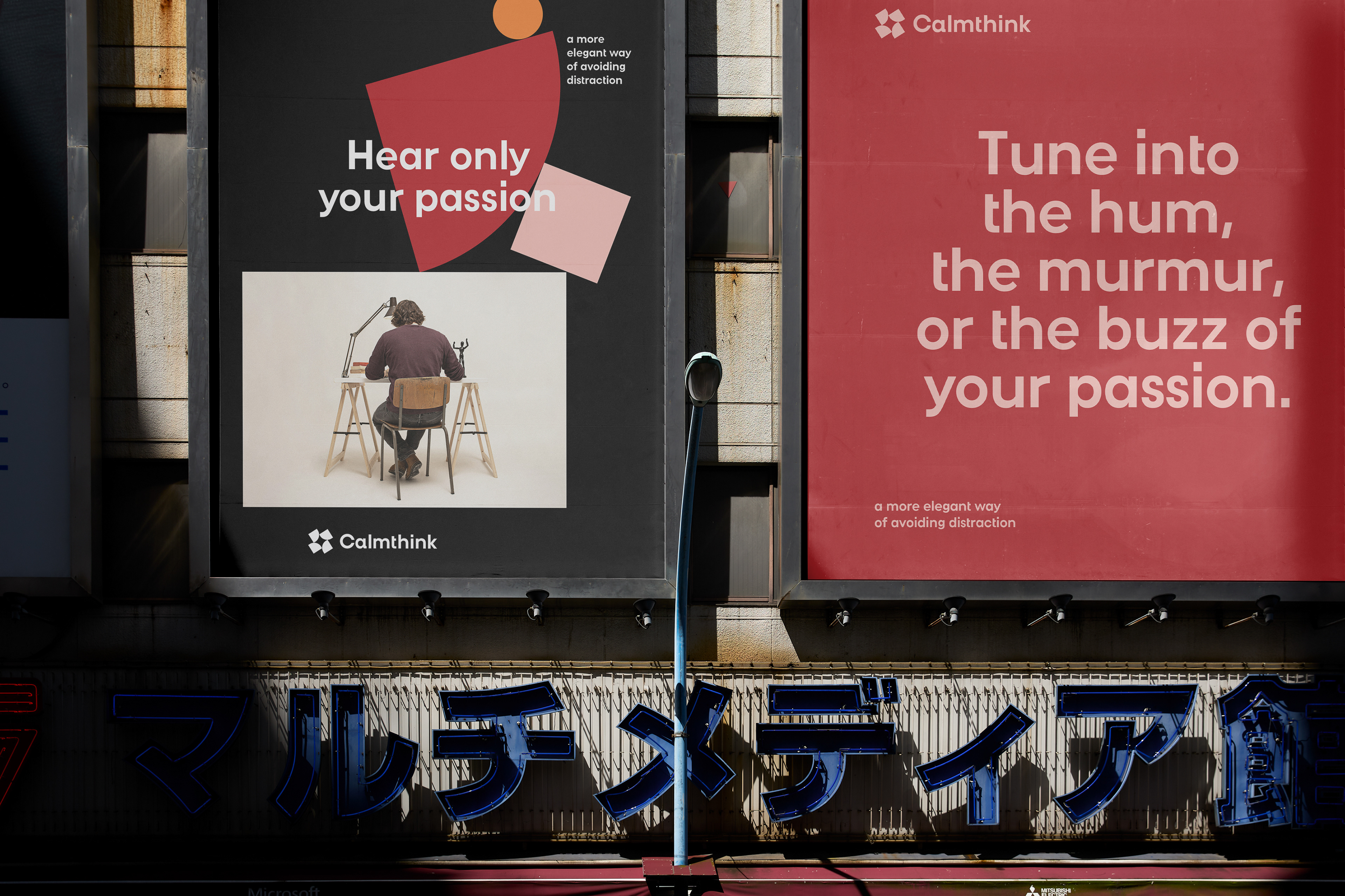
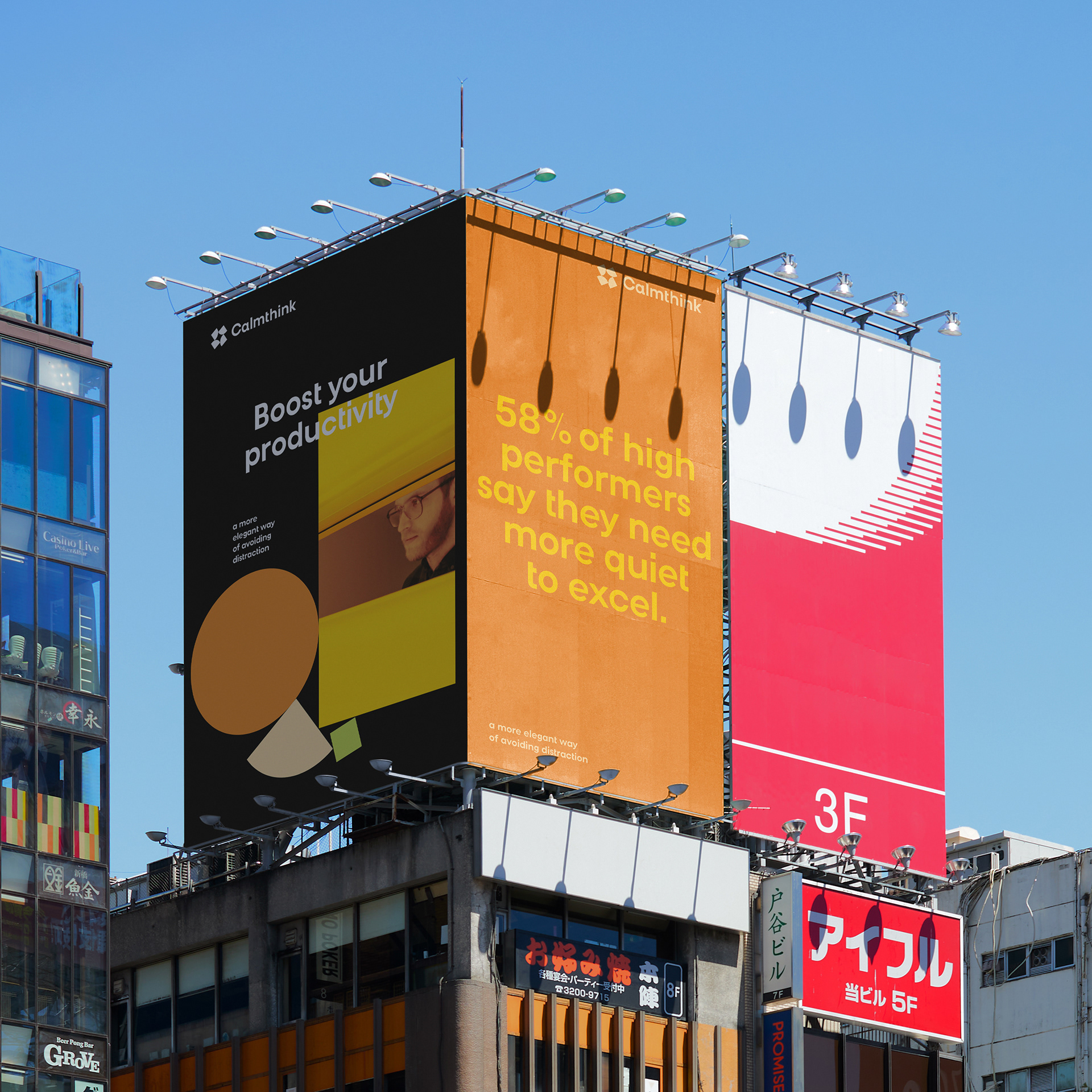
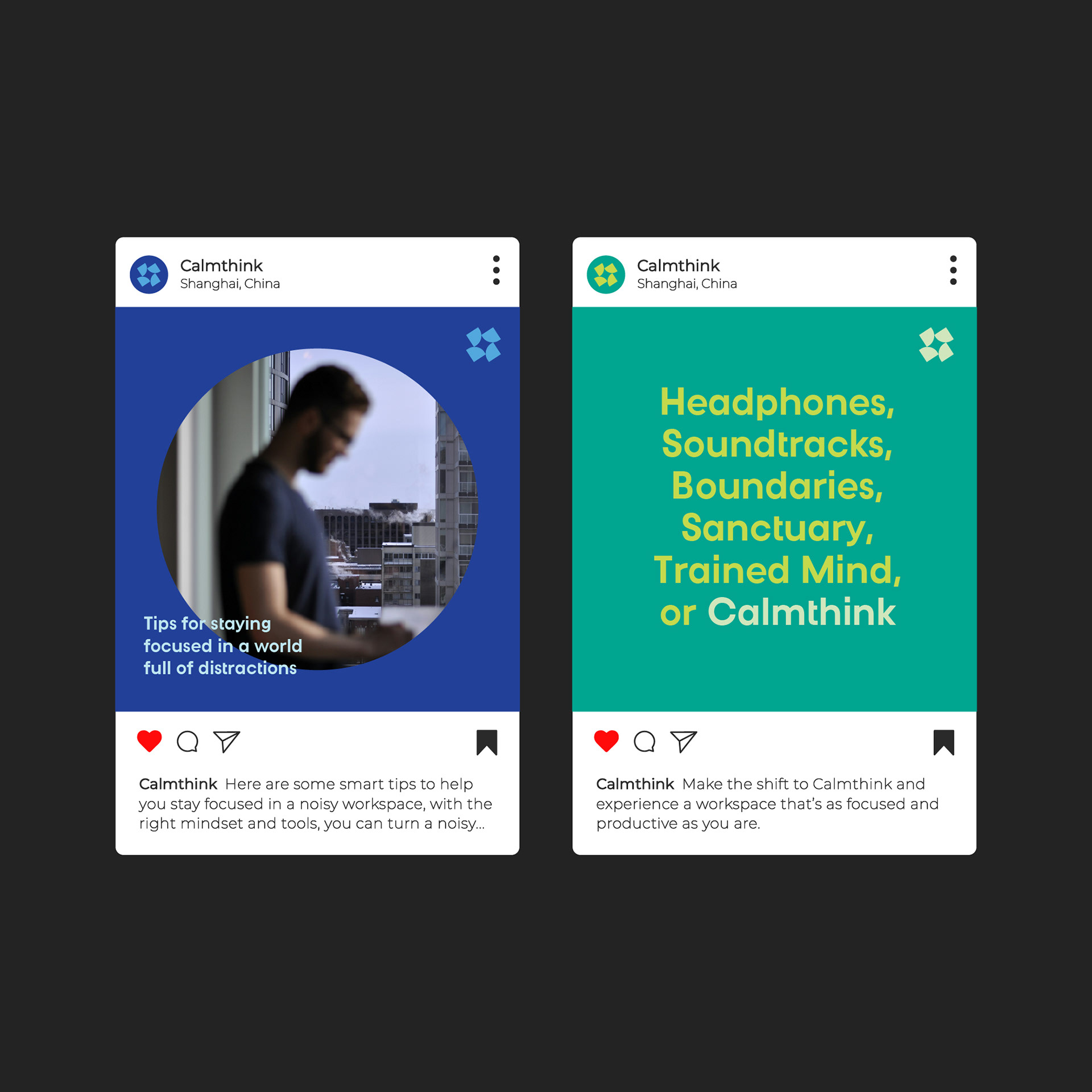
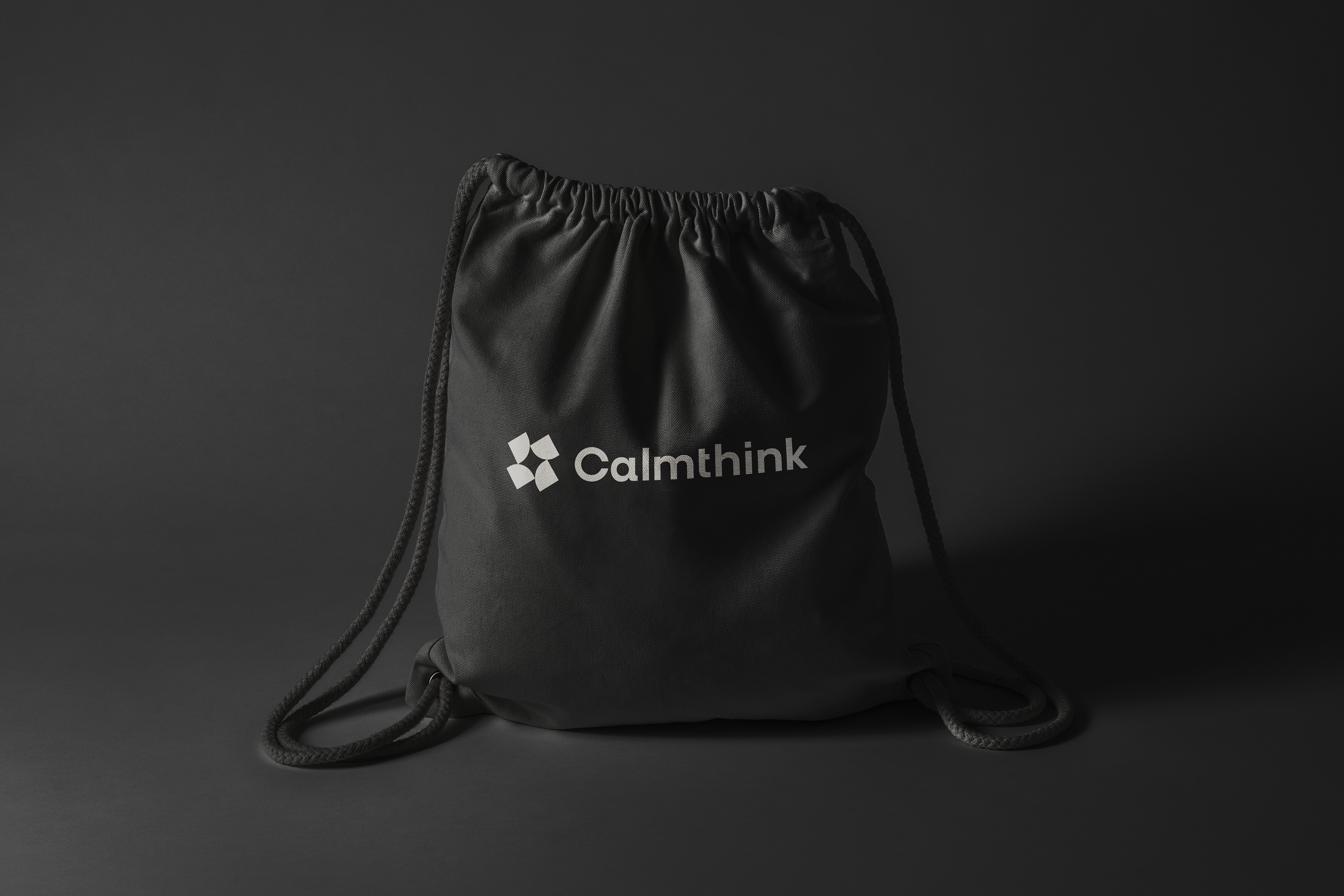
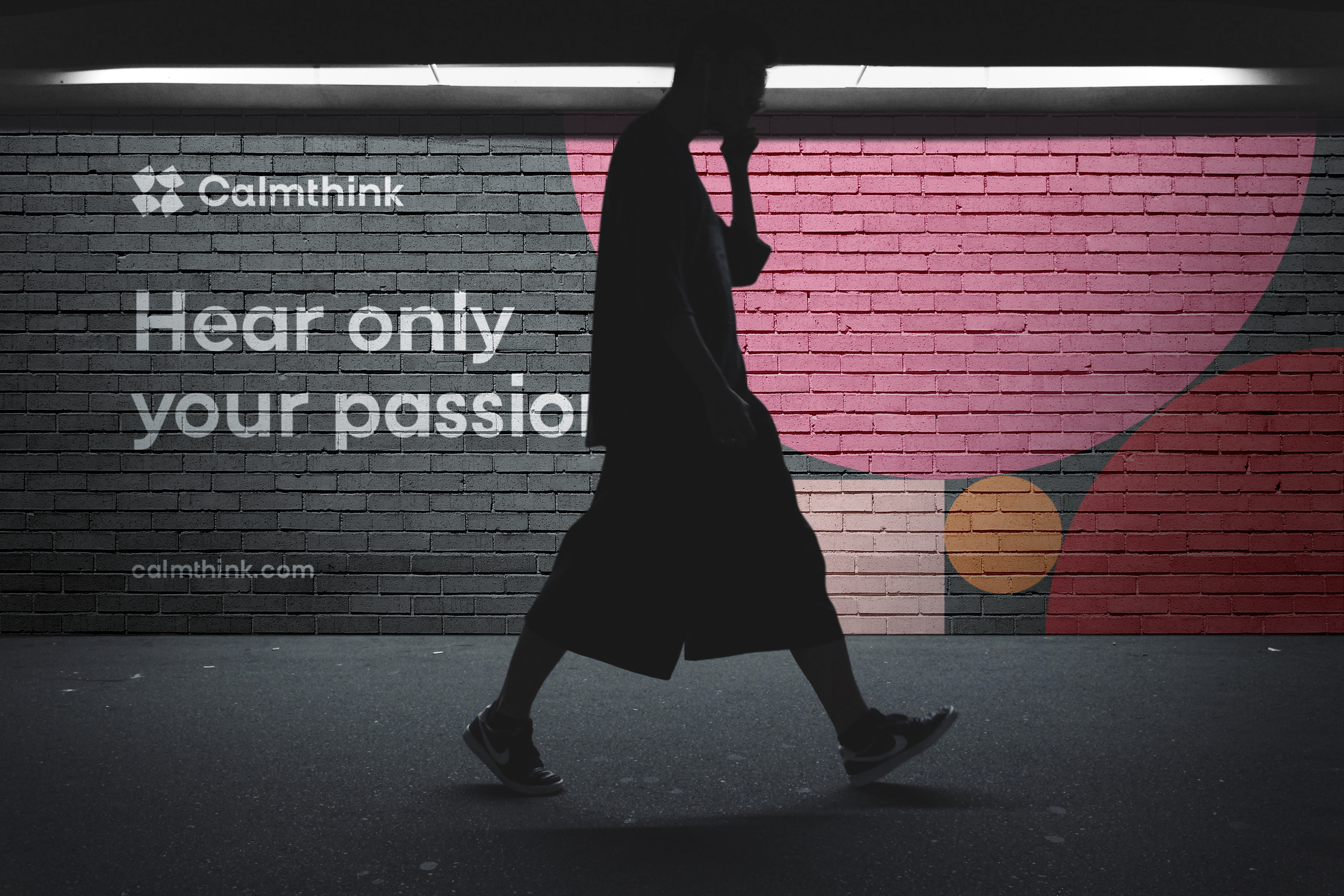
Calmthink is an innovative startup based in Shanghai, dedicated to enhancing open-space work environments and helping teams and individuals regain focus. To achieve this mission, the company has developed a comprehensive range of portable capsules that effectively address office clutter, reduce noise, and create a more conducive and productive working atmosphere for their clients.
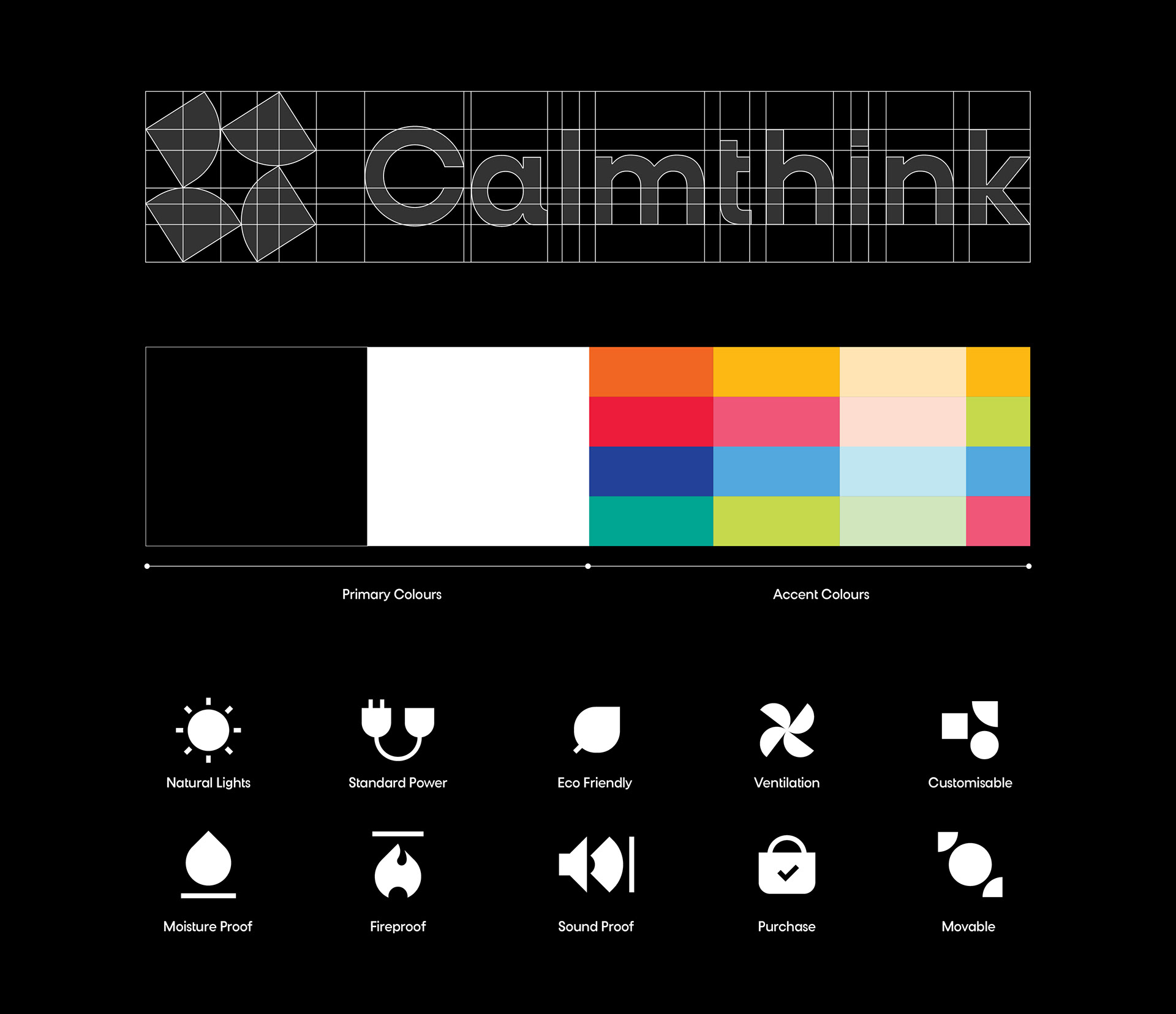
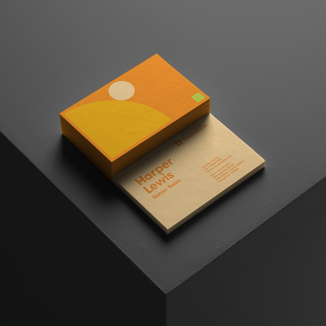
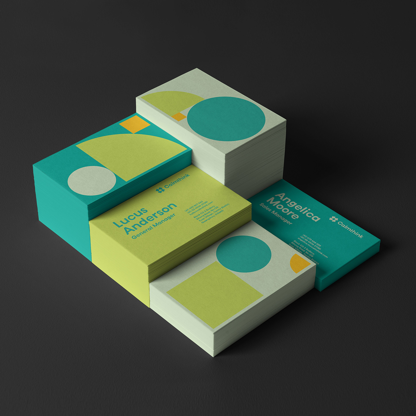
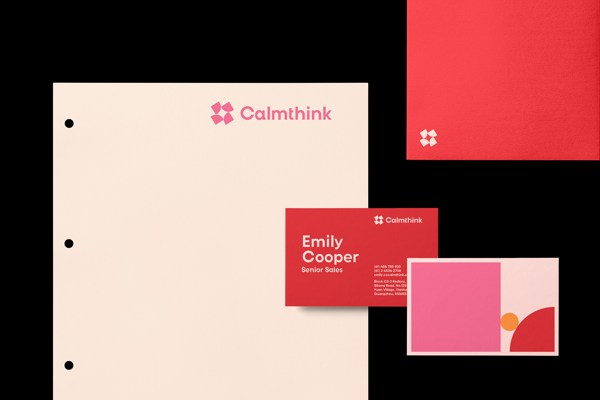
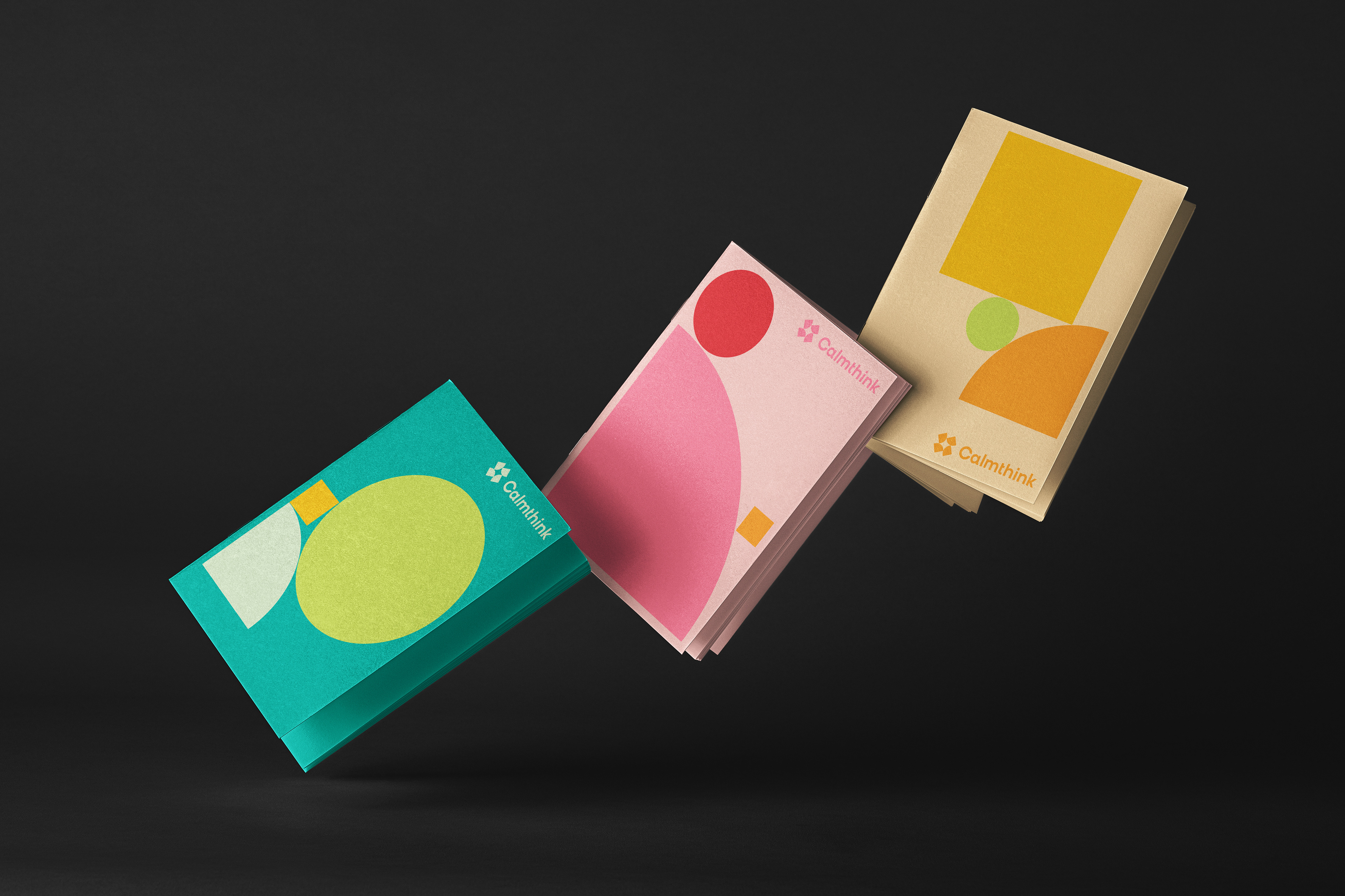
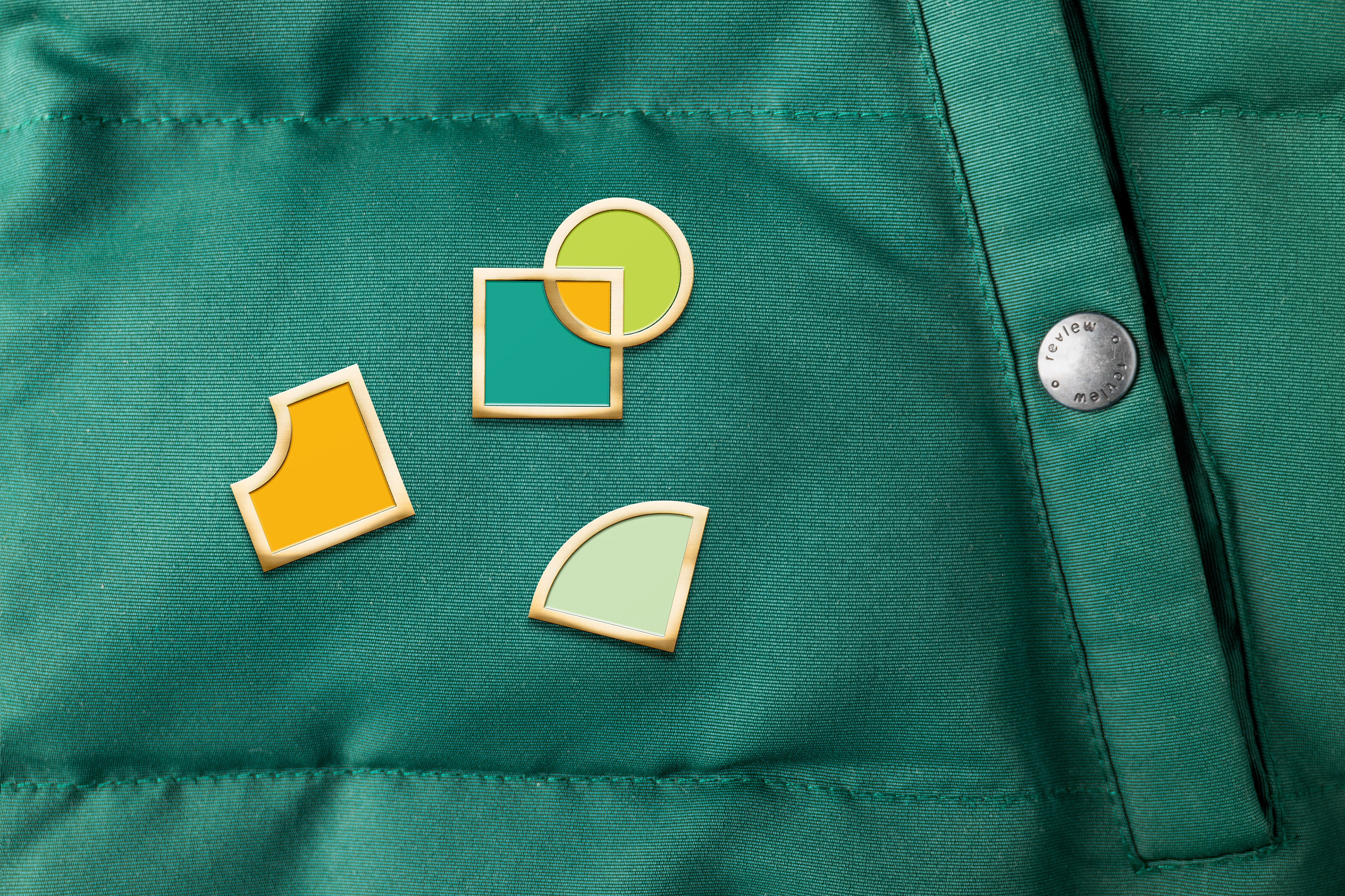
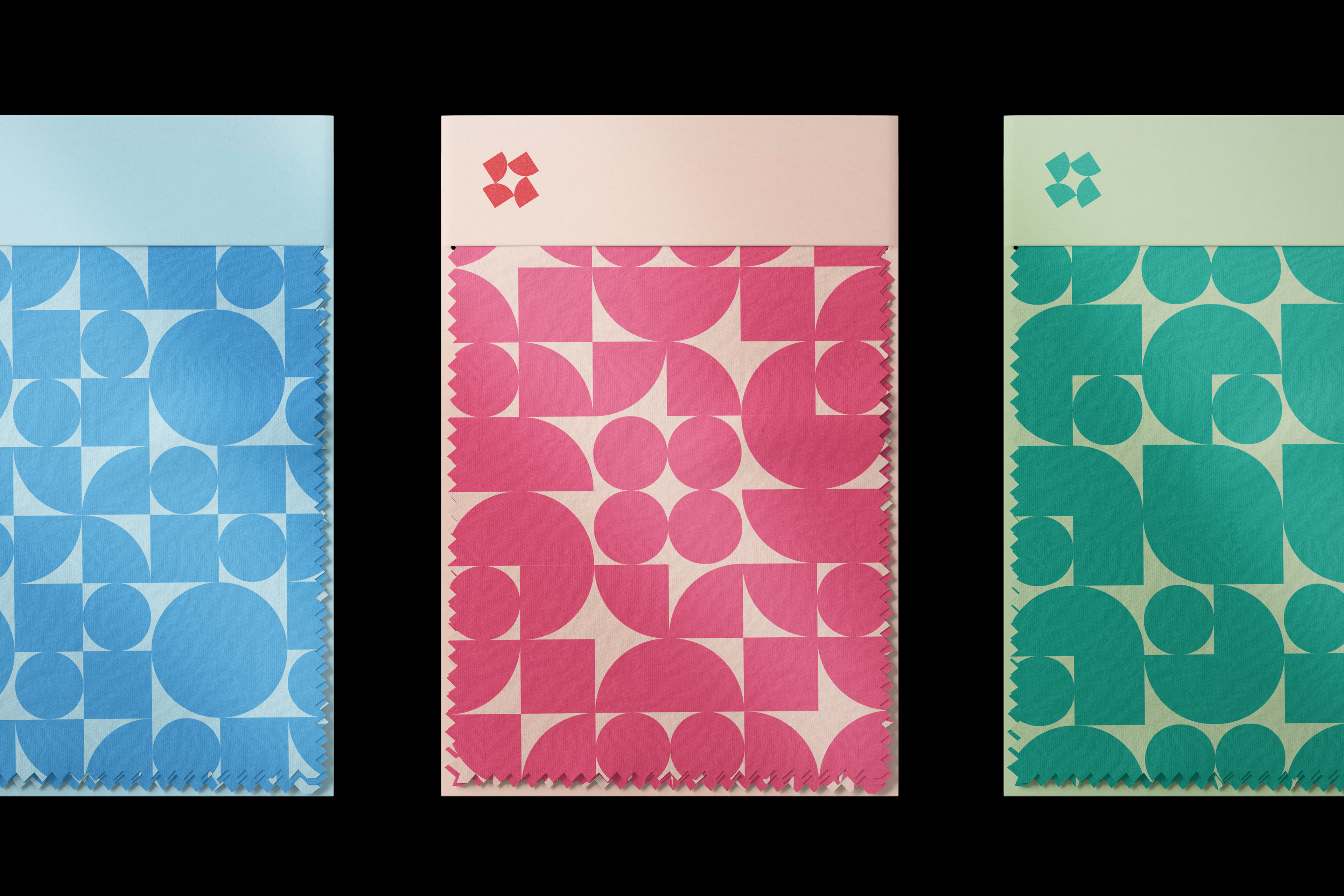
Inspired by the shape of a capsule, the logo is built around a perfect square, which is divided into four smaller sections. Each segment represents a distinct emotion or activity: creativity(green), focus(blue), productivity(orange), and passion(red). The square symbolises stability and rigor, evoking a sense of trust and reliability, just like Calmthink acoustic boothes create an intimate and personal working space for people who pursuit for productivity and efficiency. The seamless fusion of square shapes and rounded elements strikes a harmonious balance between a professional environment and a space that nurtures both physical and mental well-being, unlocking the potential within. The thoughtful arrangement of the four blocks embodies the harmony and balance essential for fostering focus. From creativity to productivity, each capsule enhances our state of mind. To bring this concept to life within a unified visual identity, colour plays a central role. It is well understood that colours can stimulate different areas of the brain, and we have selected four key attributes, each paired with a specific colour, to resonate with the emotional and functional traits of our design.