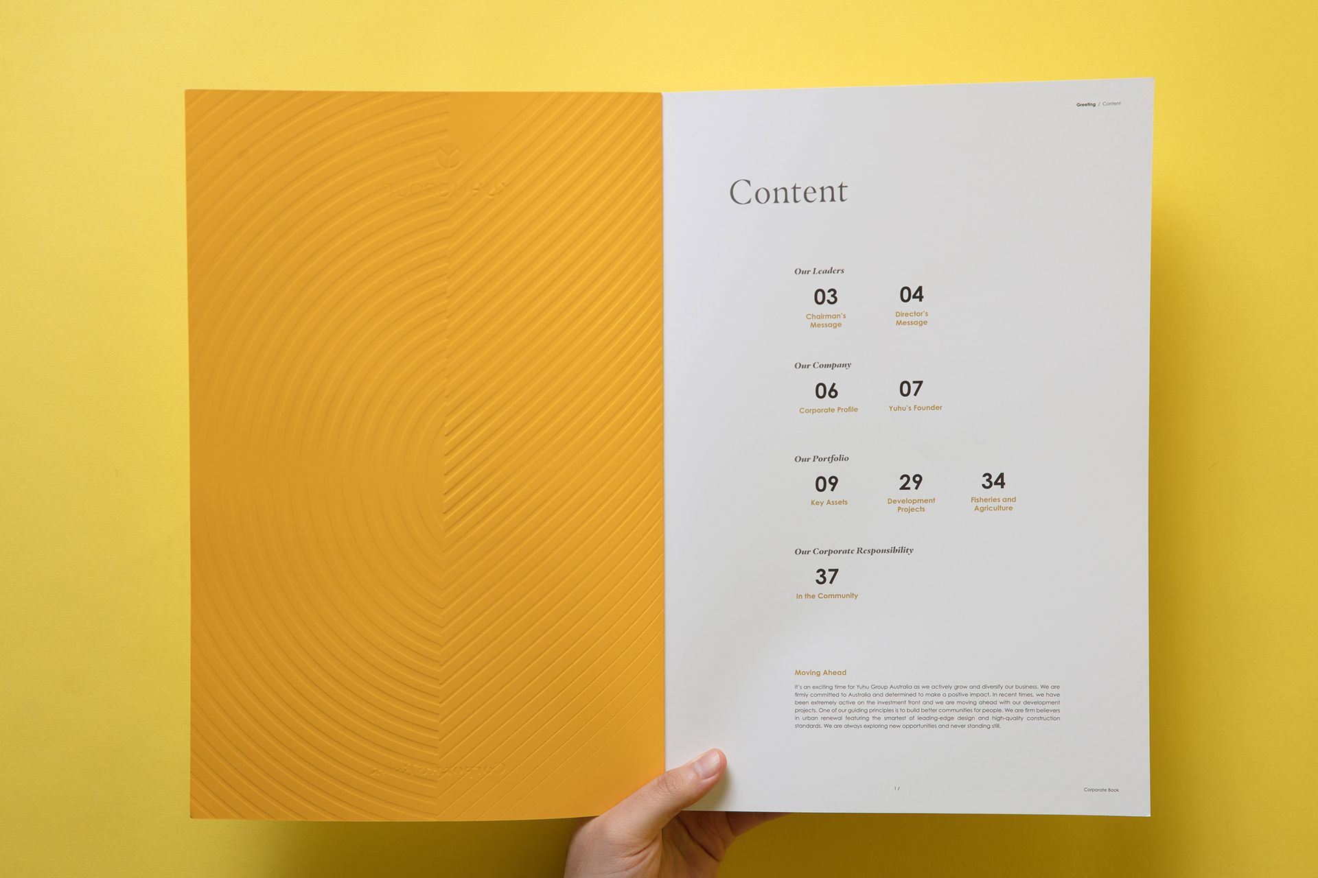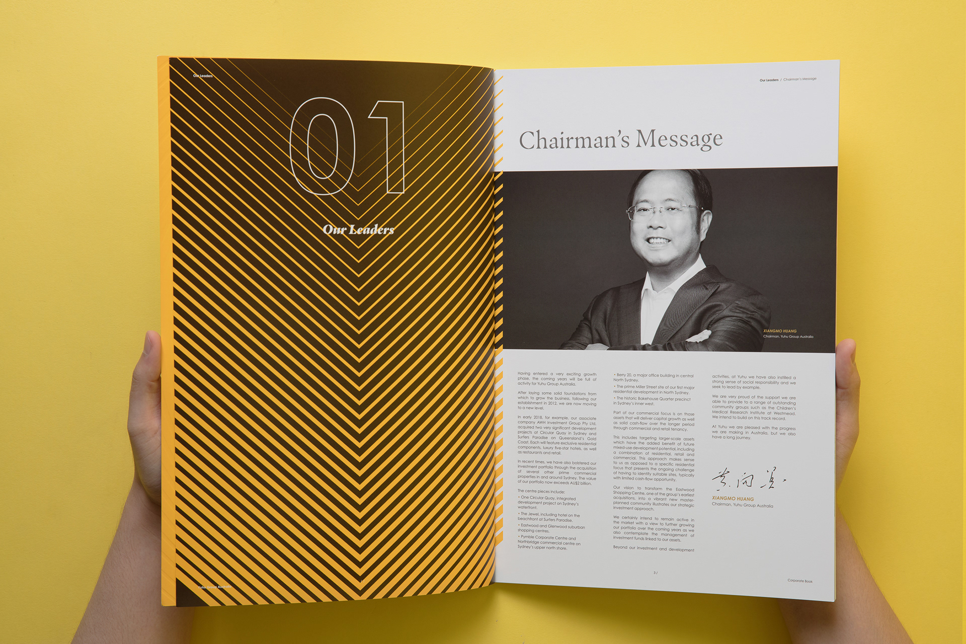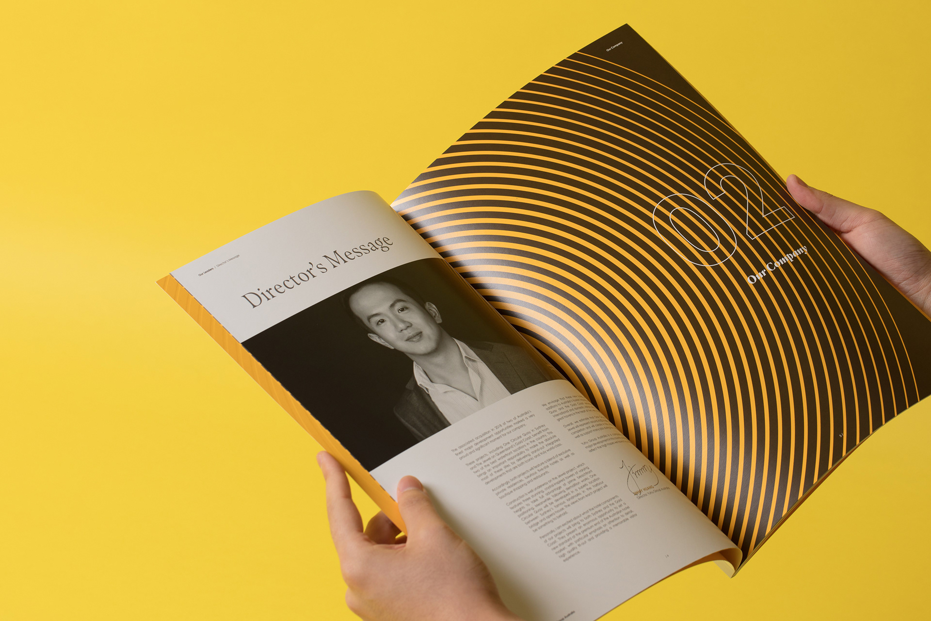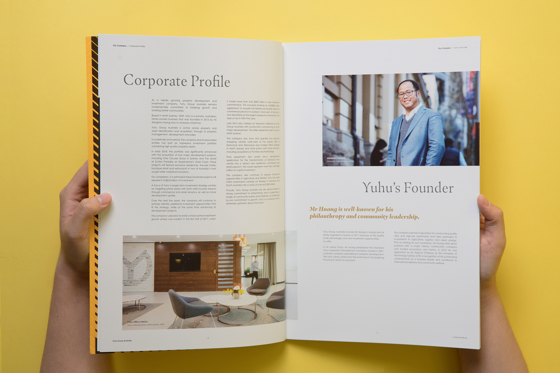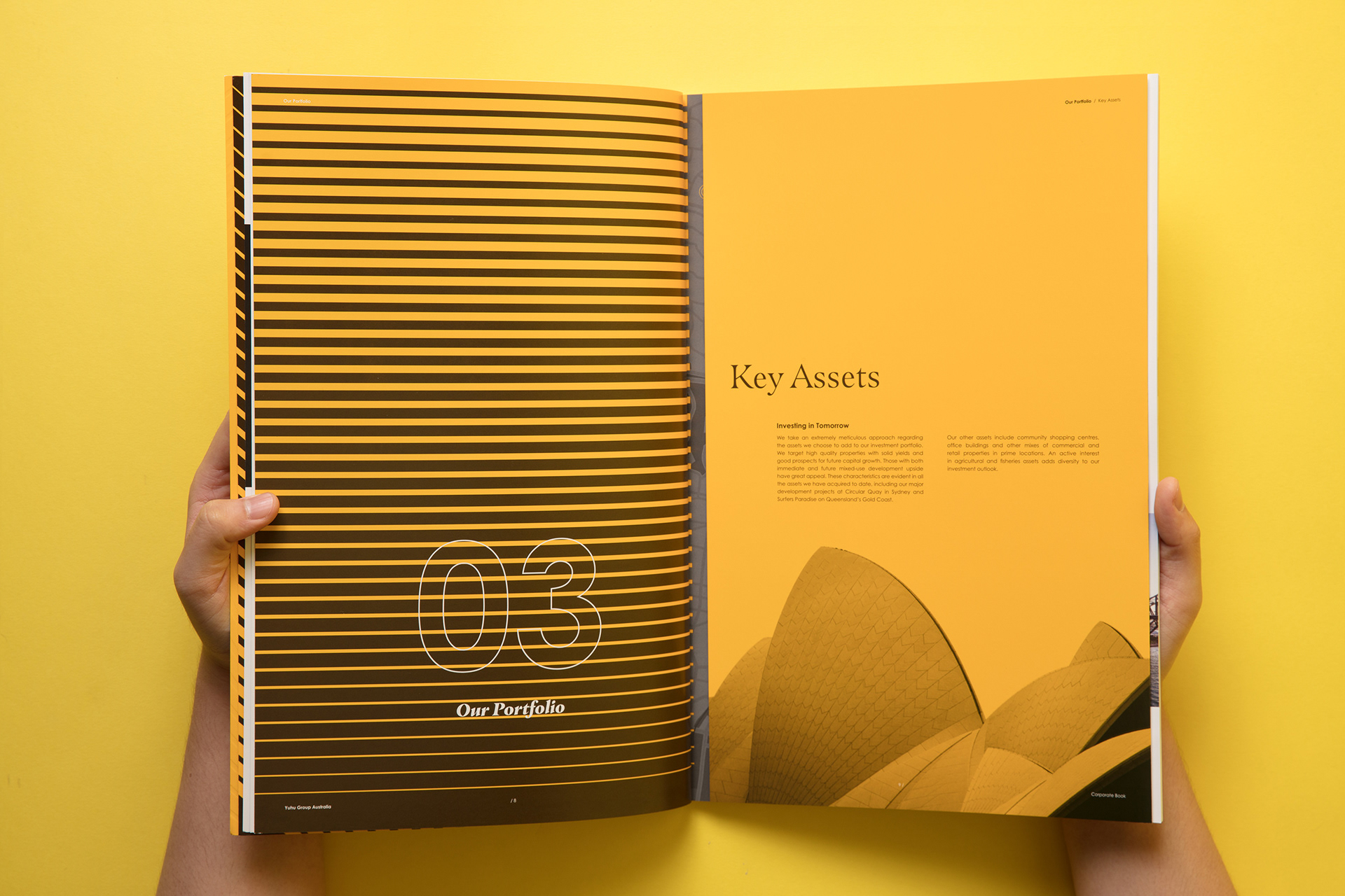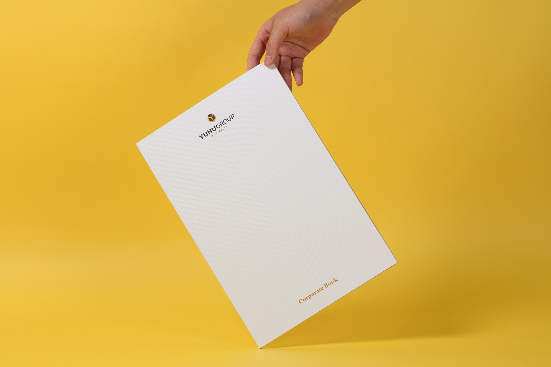
Based in North Sydney, YUHU has quickly built up an impressive NSW property portfolio in the vicinity of Sydney CBD. Whilst their original branding colour palette was evolved, updated and enriched, a brand new set of four minimalistic patterns, inspired by its brand mark, were developed for this corporate book design. With imageries flexibly laid out in a grid system, the brochure delivers a professional brand image with the view to express the company’s innovative and creative culture. By utilising spot UV applied on the inner pages and embossing on the cover, this asset gives a modern and elegant look and feel.