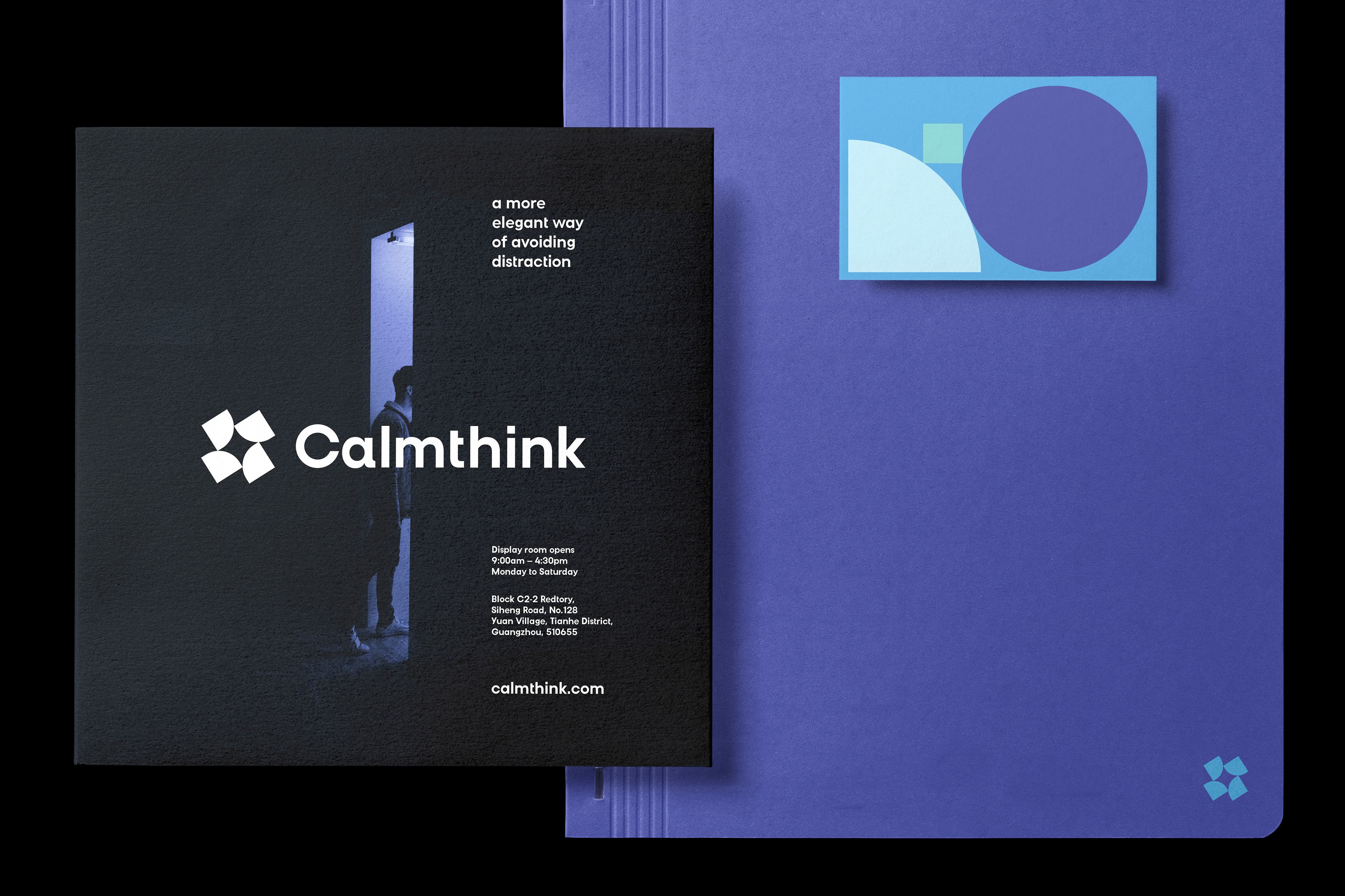
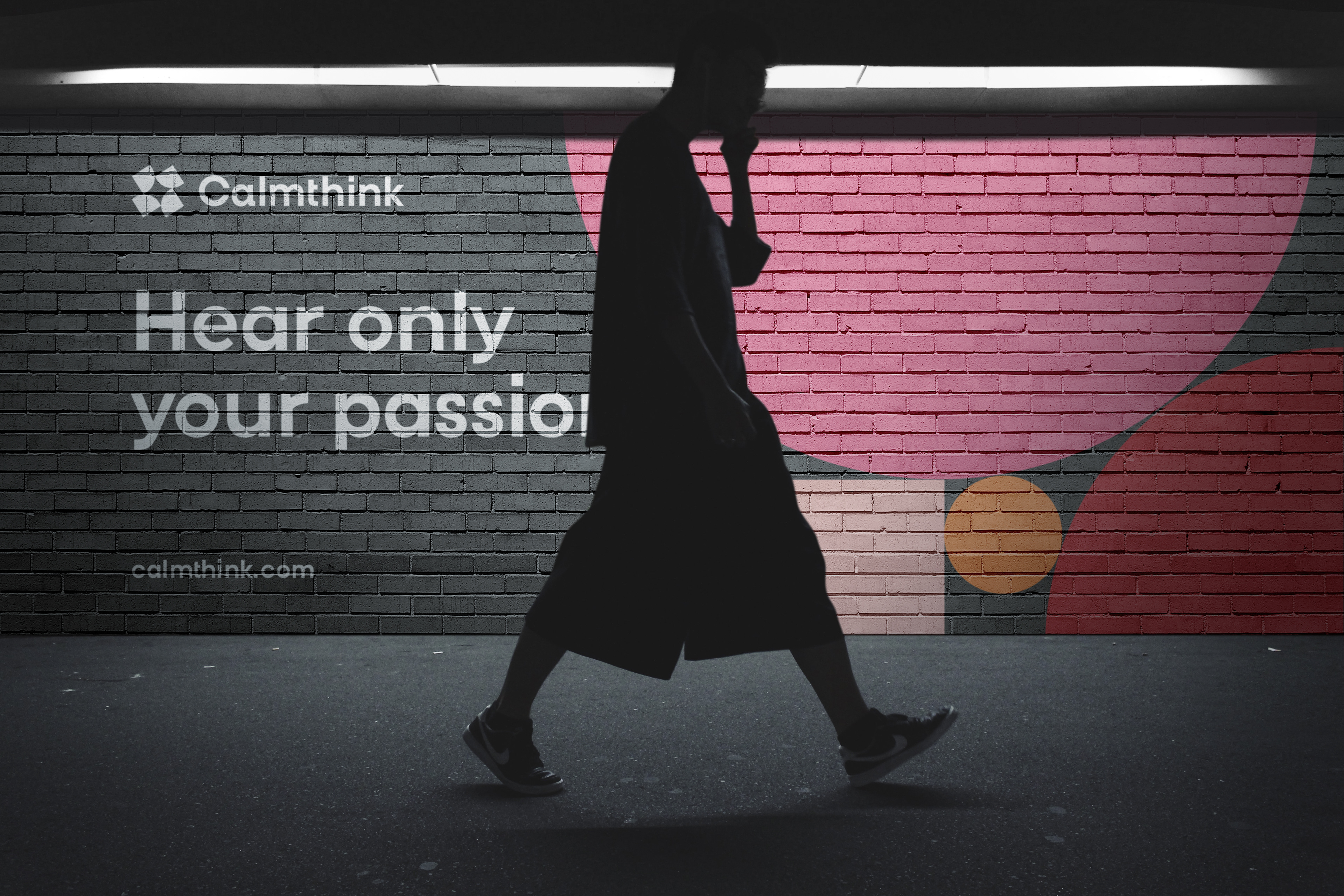
Calmthink is a startup company based in Shanghai, aiming to help improving open-space working environment and bringing back the focus that many teams/individuals need. With that goal in mind, they developed a whole range of portable capsules, which efficiently solves office clutter, reduces noise and offers a better working environment for their customers.
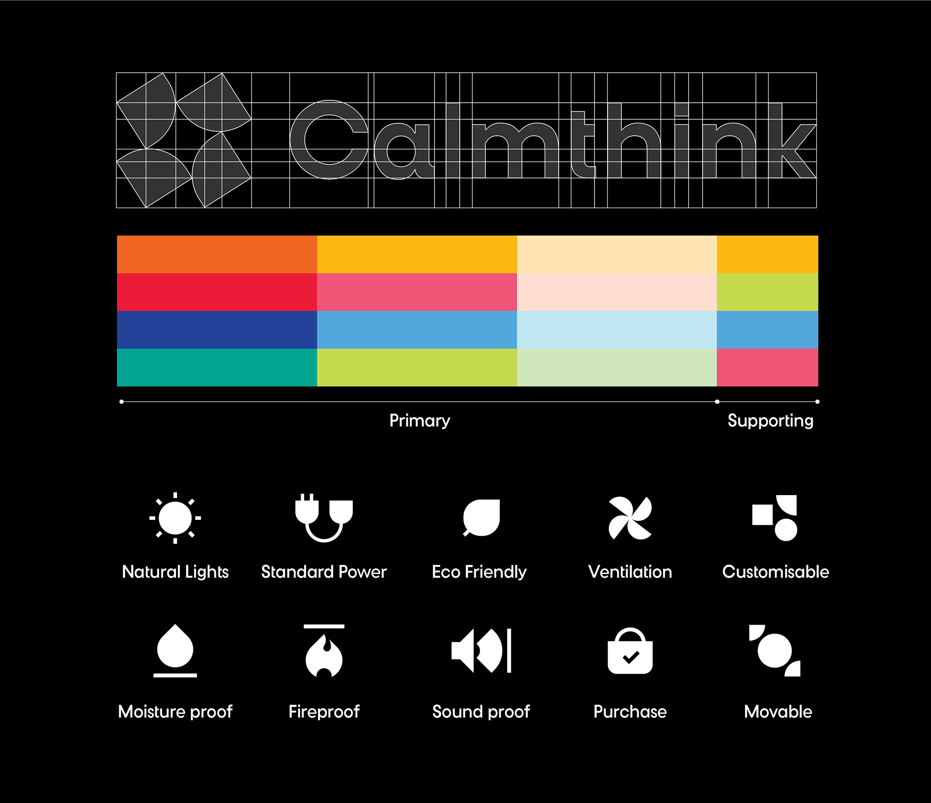
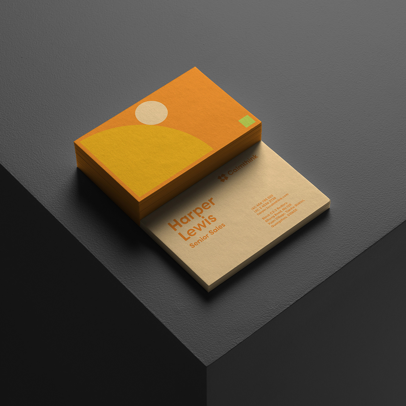
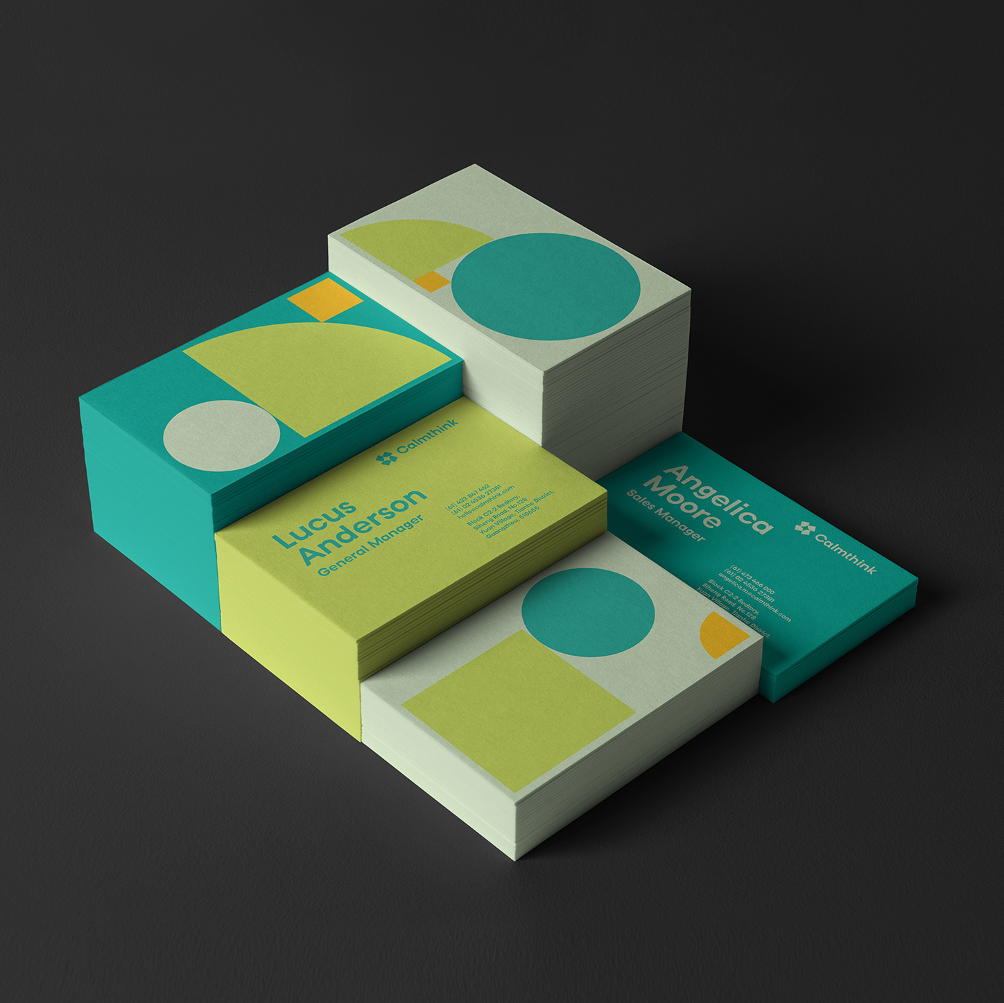
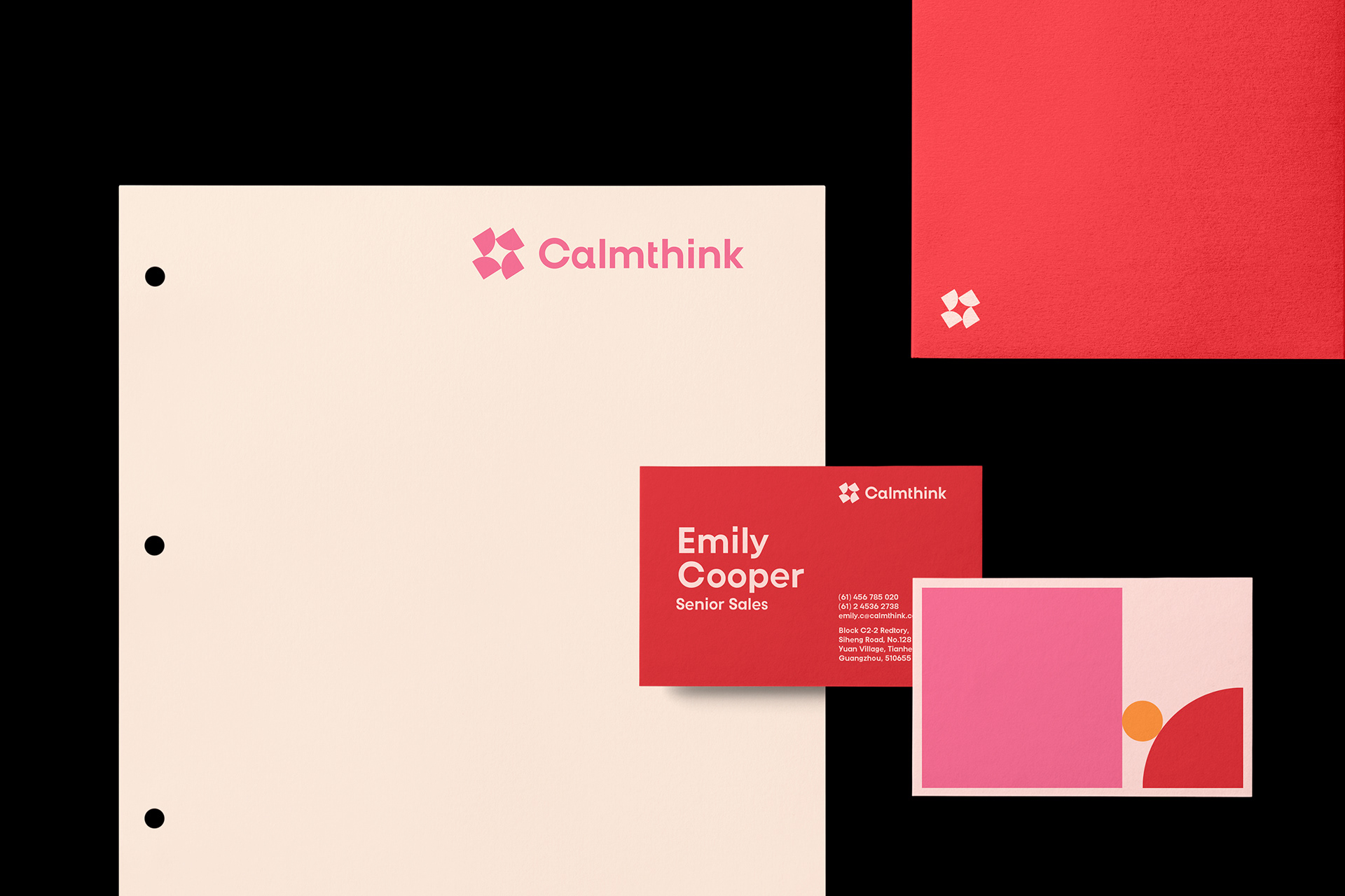
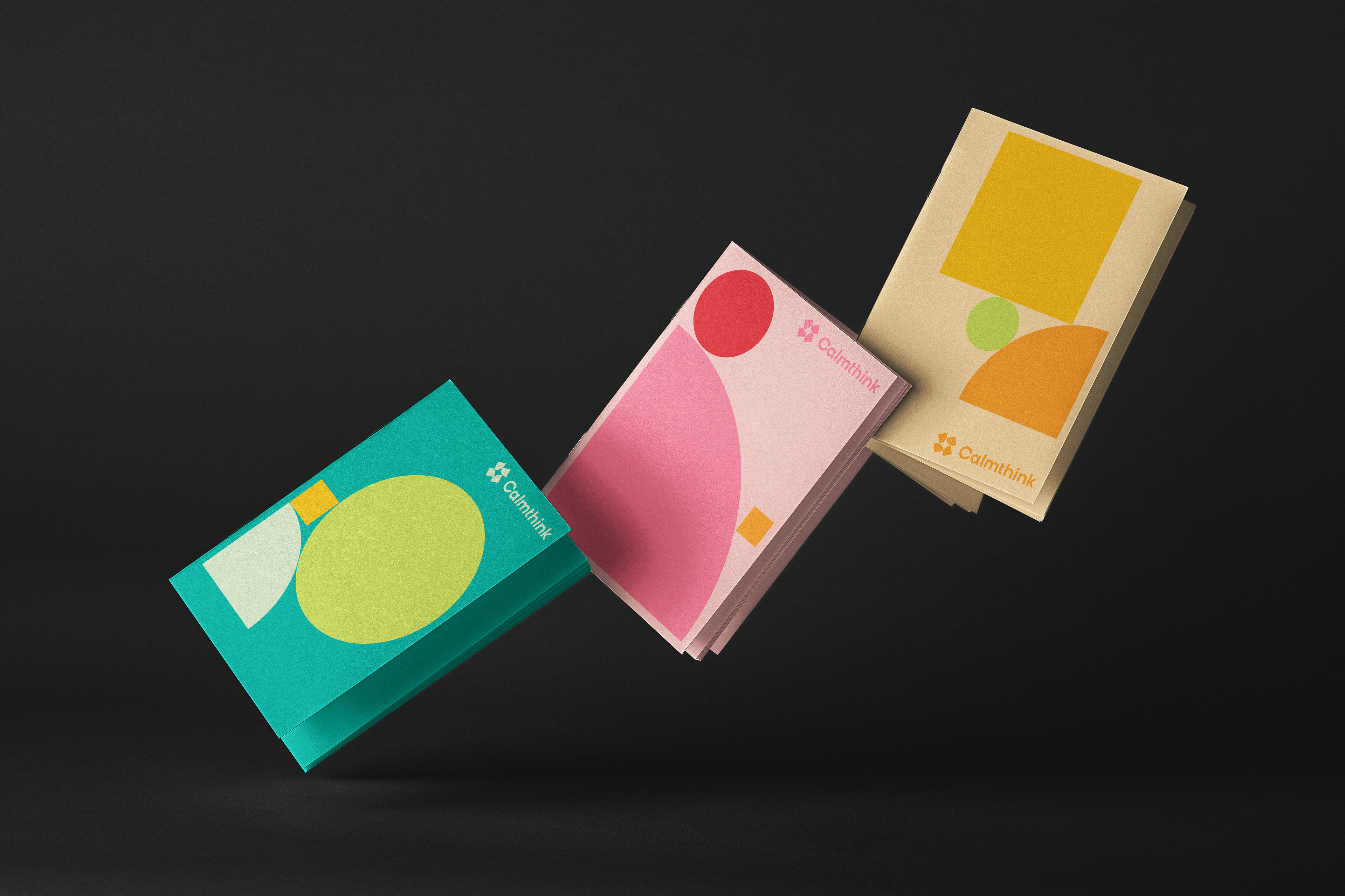
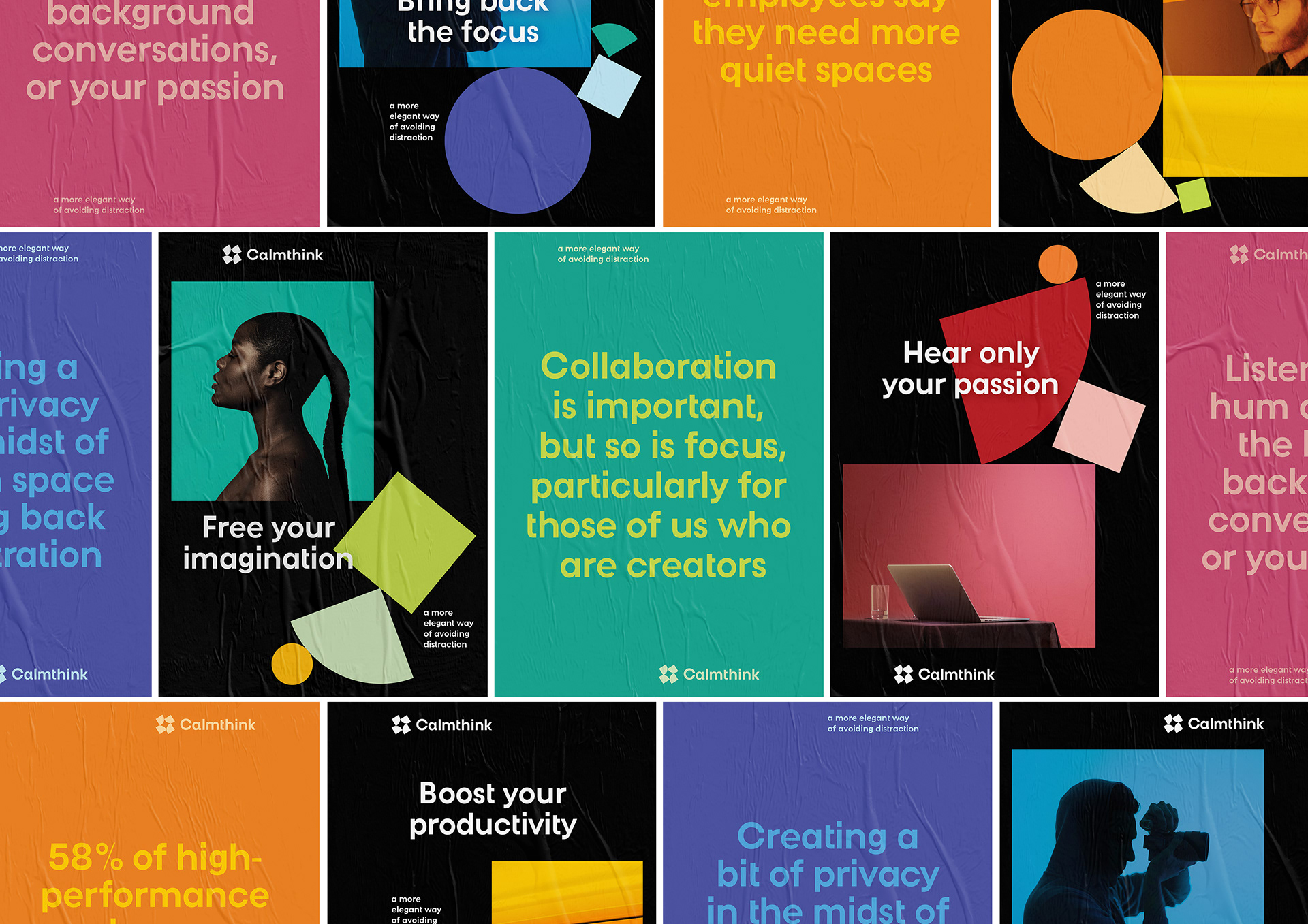
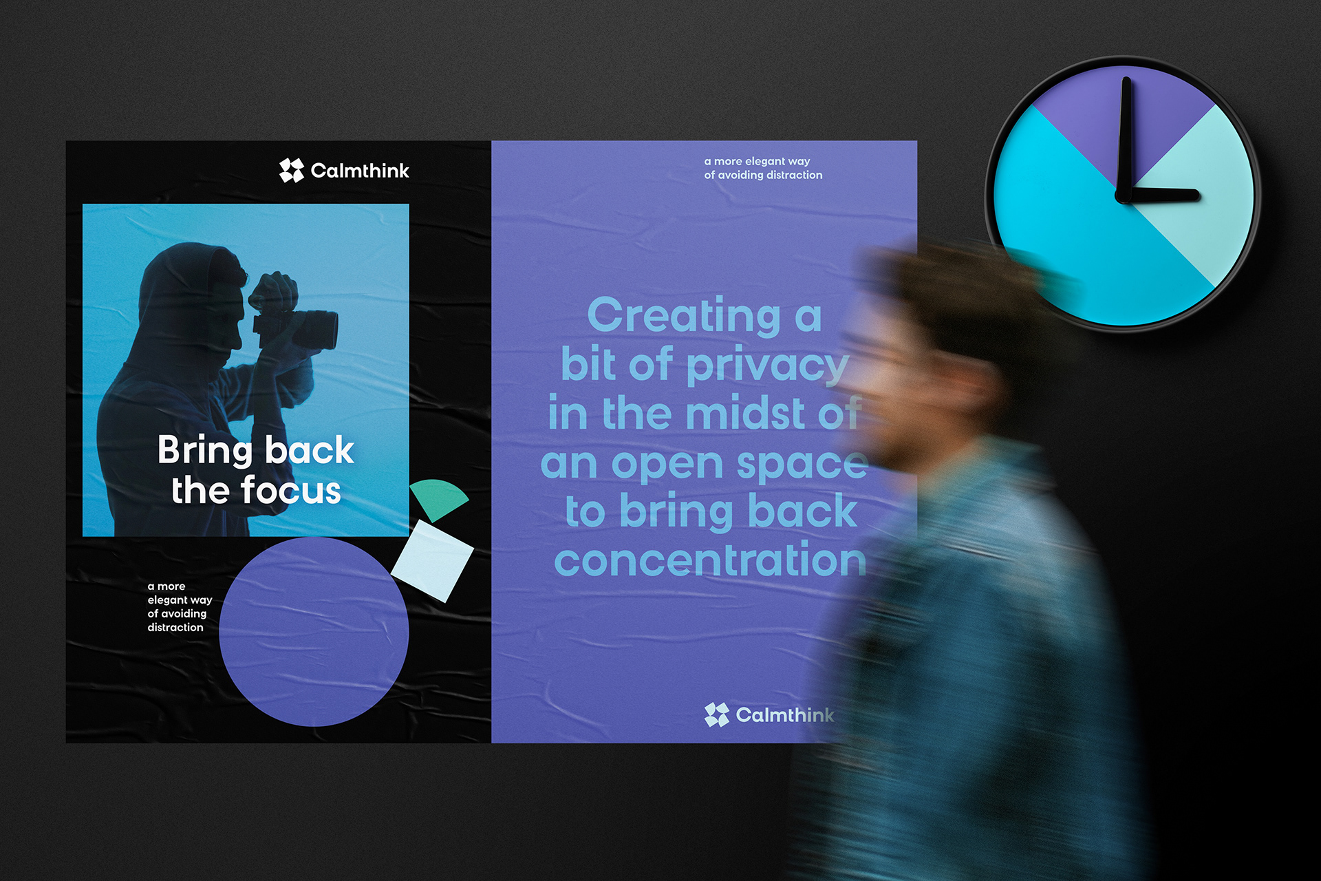
Inspired by the shape of the capsule, the mark uses a perfect square as a base. By splitting the square into 4 smaller components, each portion represents a type of emotion/activity - creativity, focus, productivity and passion. Square symbolises stability and rigour, that delivers a sense of trust and reliability and by rounding up its corners, we endows emotion and humanity to the mark. The harmonious integration of square shapes and circular details achieve an ingenious balance between a professional working environment and a space that bring comfort to the body and mind to unleash potential. The delicate combination of each block symbolises harmony and balance, necessary to achieve focus. From creativity to productivity, each cabin enhances our state of mind. To translate this into a coherent visual identity system, nothing speaks better than colour as it is well known that specific colours can trigger a different part of our brain. We identified 4 main attributes to which we associated 4 colours.