Alaya Naturals ® raises standards in wellness.The design does the same.
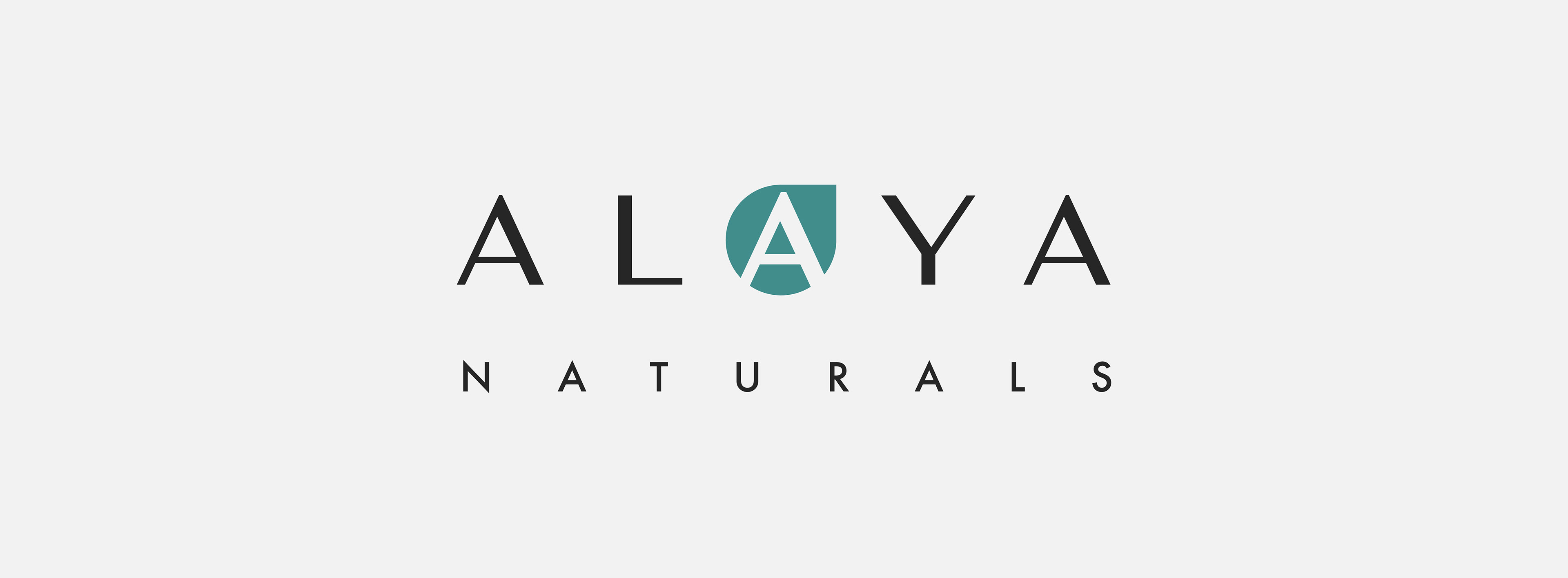
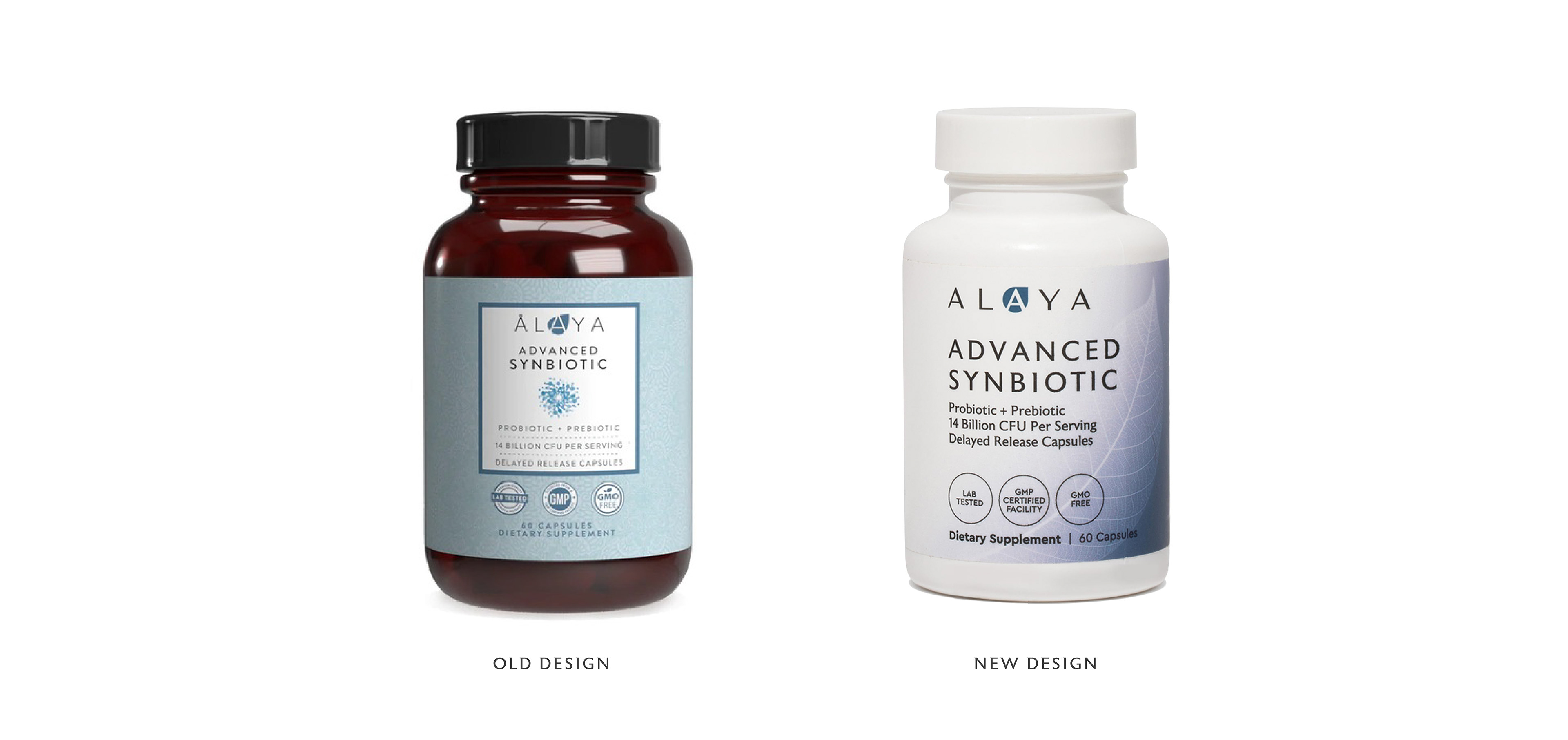
As a rebrand, the challenge was to evolve the brand to meet shifting consumer expectations while preserving key DBAs from the existing brand world. That is why the 'A' within a leaf motif was retained and refined, preserving brand equity while elevating it to reflect lived experience and disciplined formulation. Paired with new DBAs, including a bespoke typeface, a refined gradient colour system, and distinctive photographic elements for each category, the identity signals higher standards at every touchpoint. The result is a look and feel that is sophisticated, clean, and considered. Natural and sleek at once. Scientific in tone, yet approachable, focused, and effective.
The design expresses Alaya’s core belief: 'more quality; more science; more results'.
A minimal design framework creates structure and calm. Space, typography, and hierarchy guide understanding. Nothing distracts. Nothing exaggerates. Every detail supports credibility and performance.
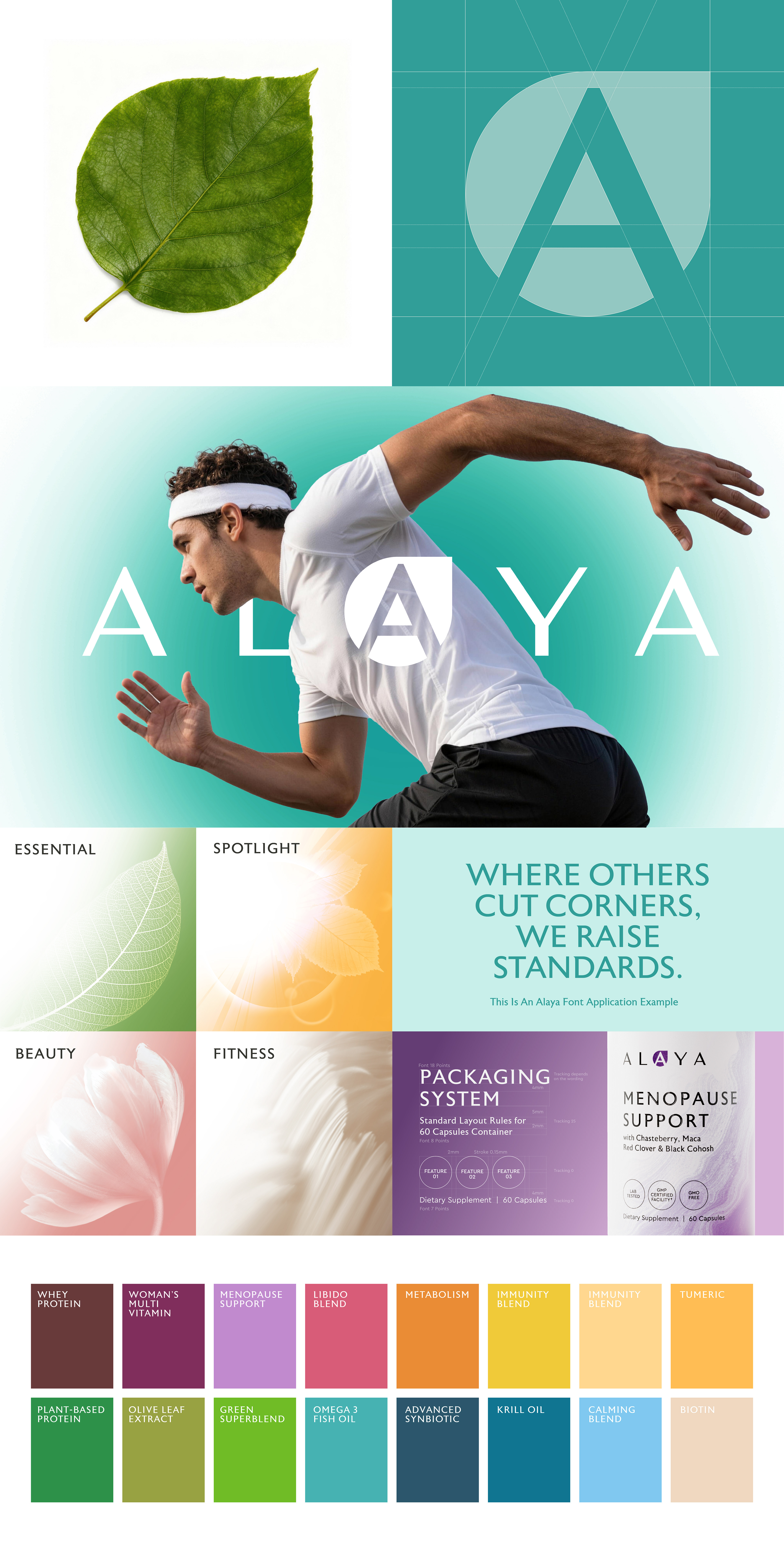
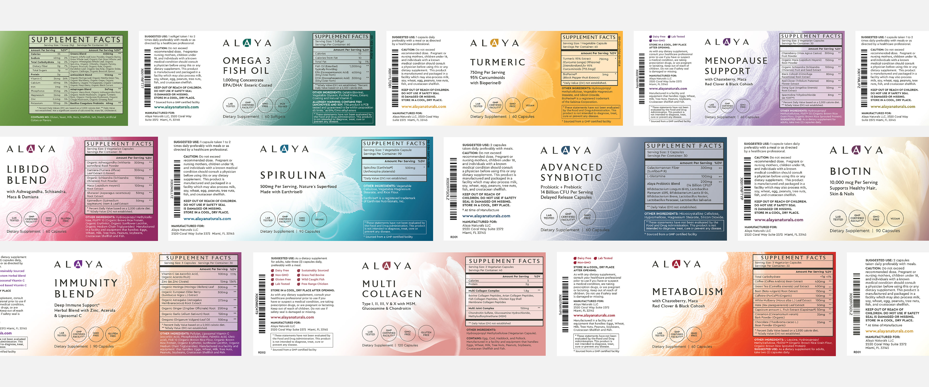
The challenge was to streamline a range of over 20 SKUs into a scalable system that supports future expansion and allows customers to quickly and confidently differentiate between products.
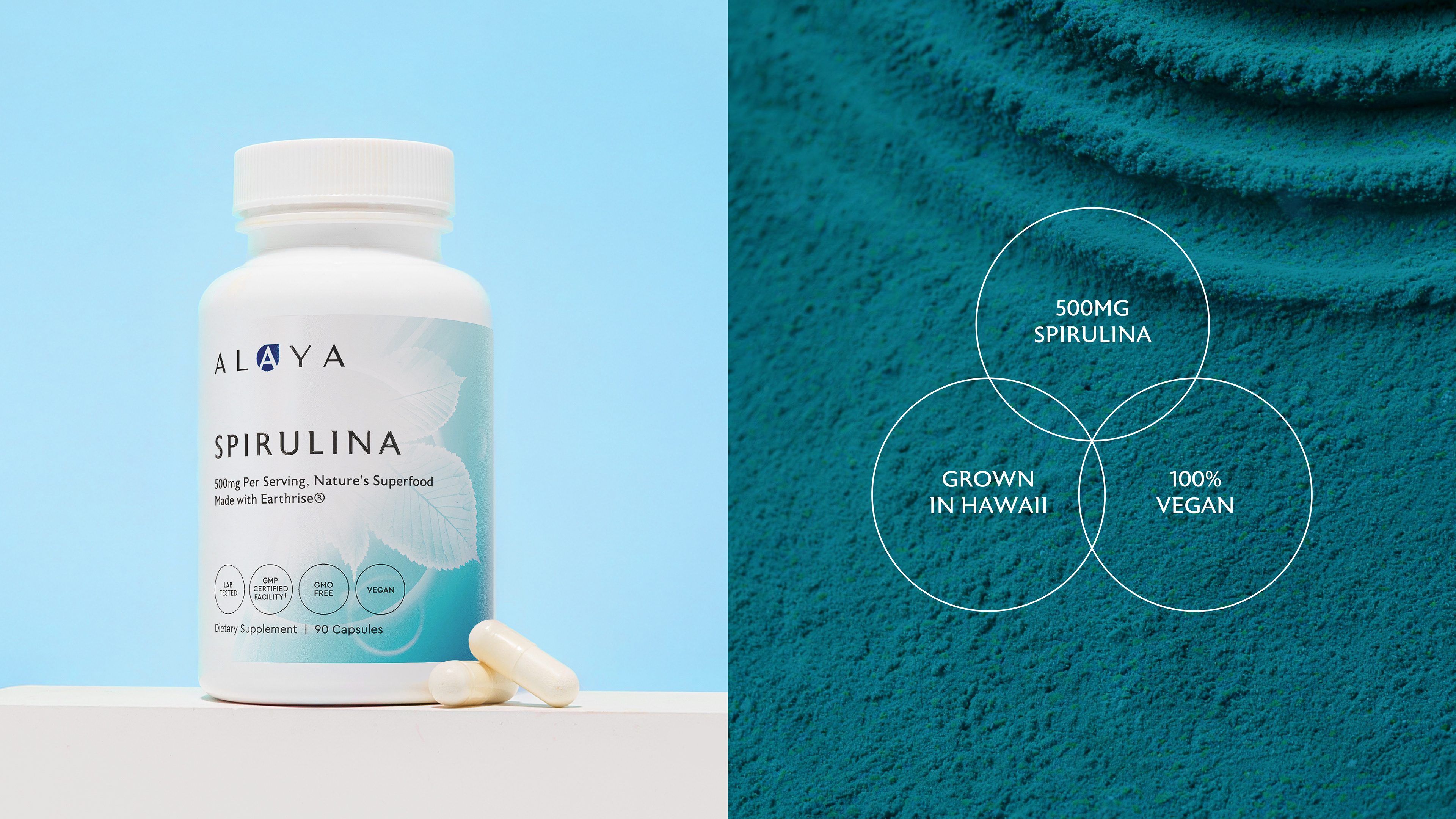
The packaging system uses 5 distinctive photographic elements: 'Leaf; Flower; Sunlight; Water and Stone', each is drawn from nature and paired with a minimal design language. Together, they bring clarity and cohesion, simplifying a range of products into 5 clear categories: 'Essentials; Beauty; Spotlight; Fitness and Solution-Based range'. These elements balance science with humanity. They bring warmth, clarity, and trust to a category often driven by noise and overpromise. A thoughtful color coding system differentiates each product while maintaining unity across the ranges.
The result feels confident and restrained. It communicates precision, care, and long term intent, at the same time it respects the intelligence of the consumer and the reality of everyday life.
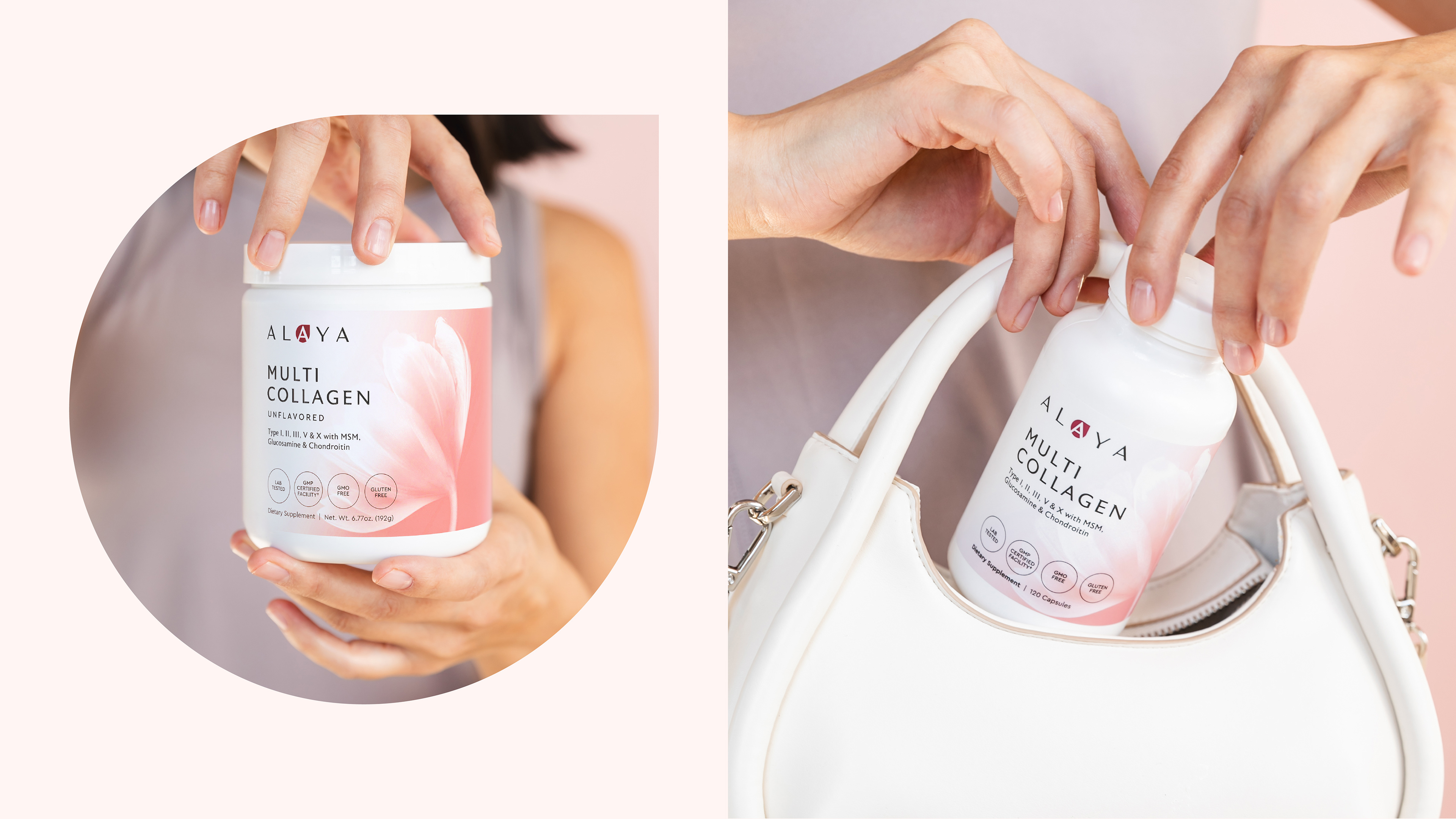



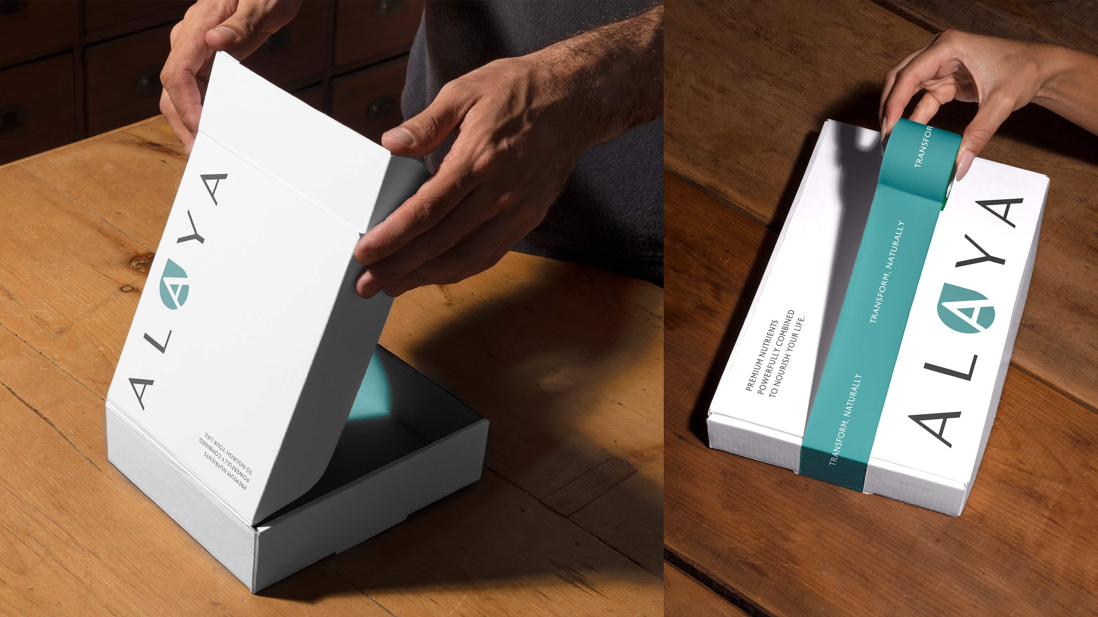
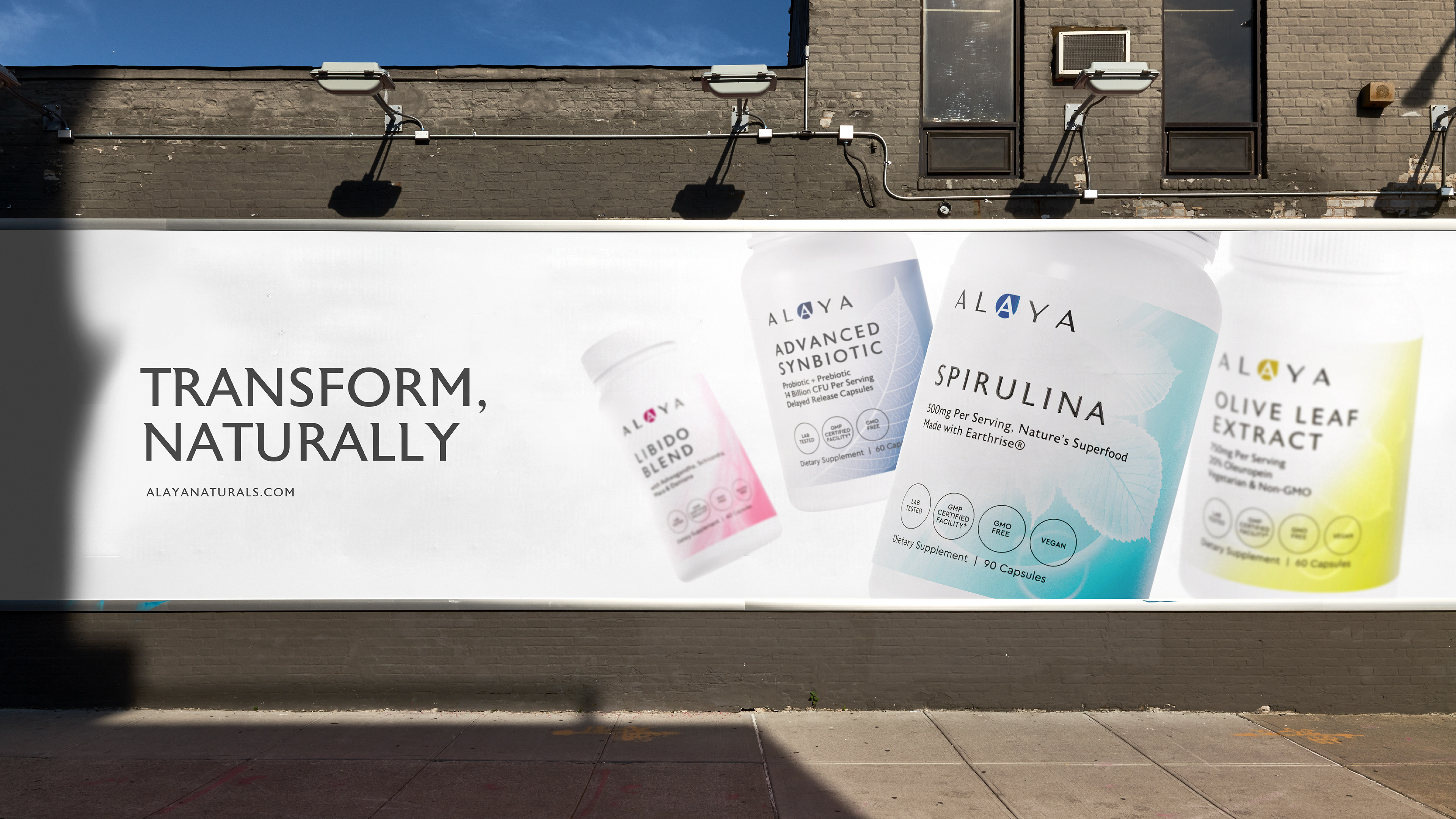
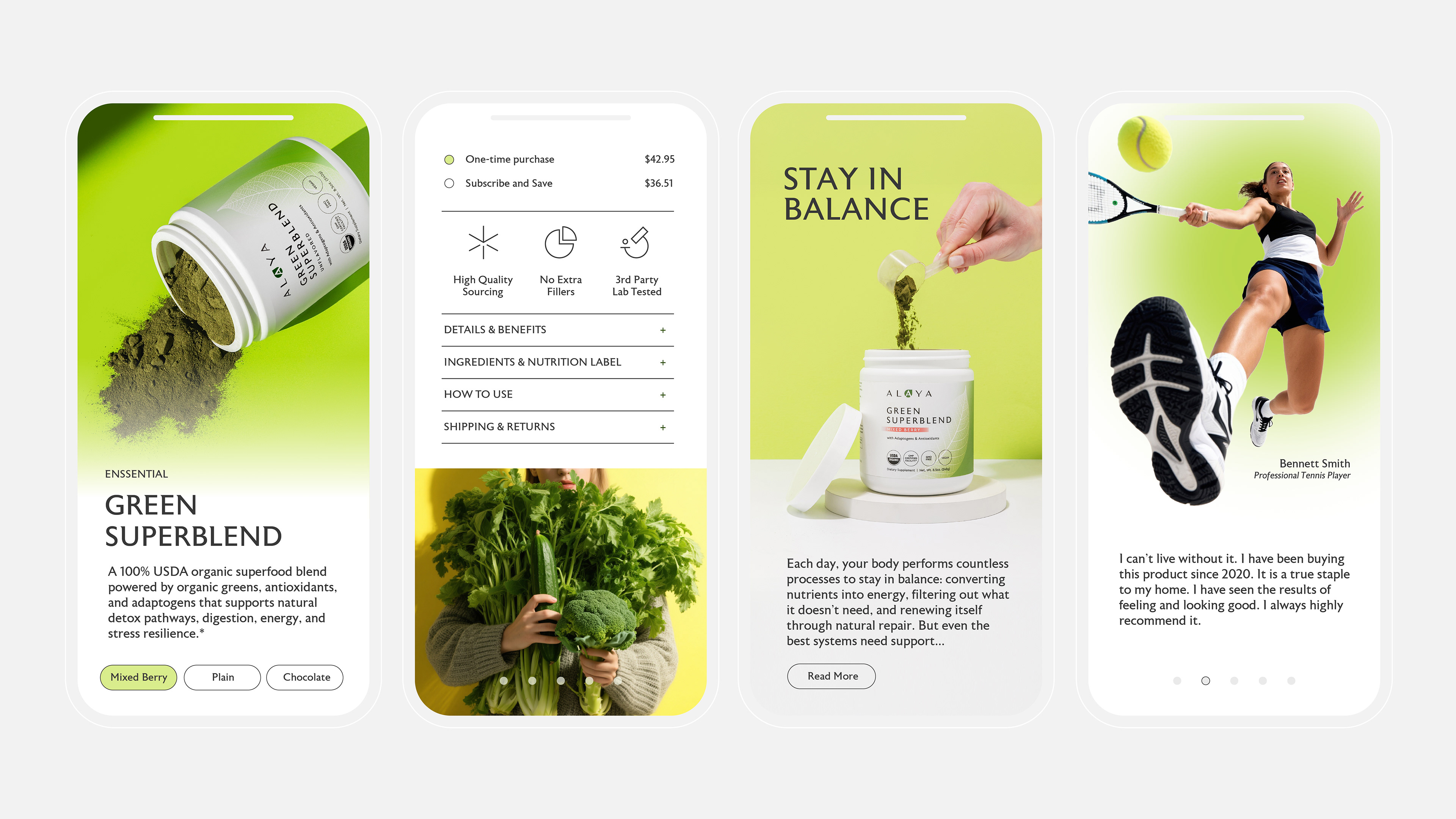
The off pack, digital, and marketing system extends the core brand principles with clarity and energy. A restrained palette of white and refined colour gradients anchors the system. It communicates trust, discipline, and confidence. This foundation stays consistent across all touchpoints to preserve credibility and recognition.
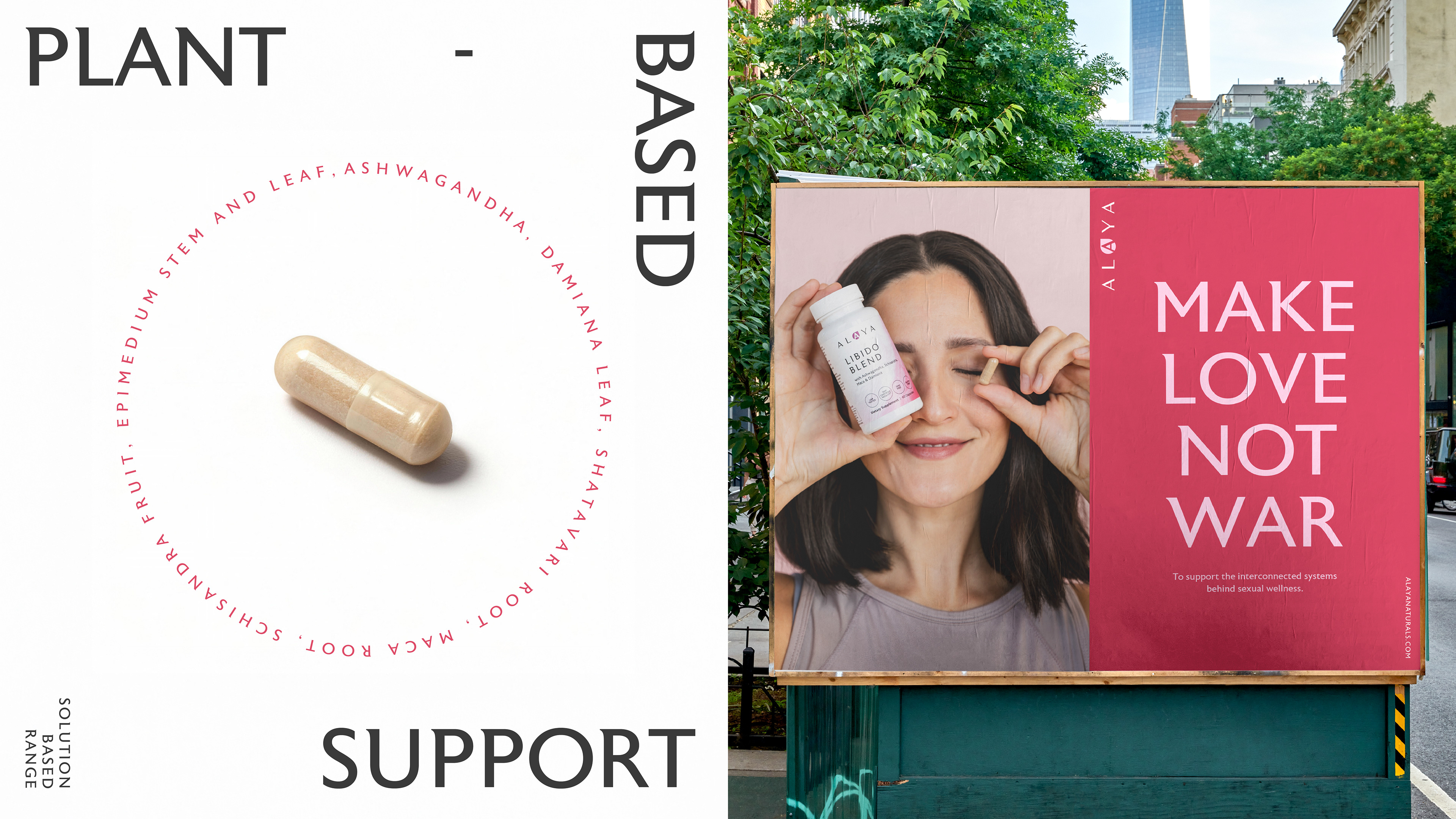
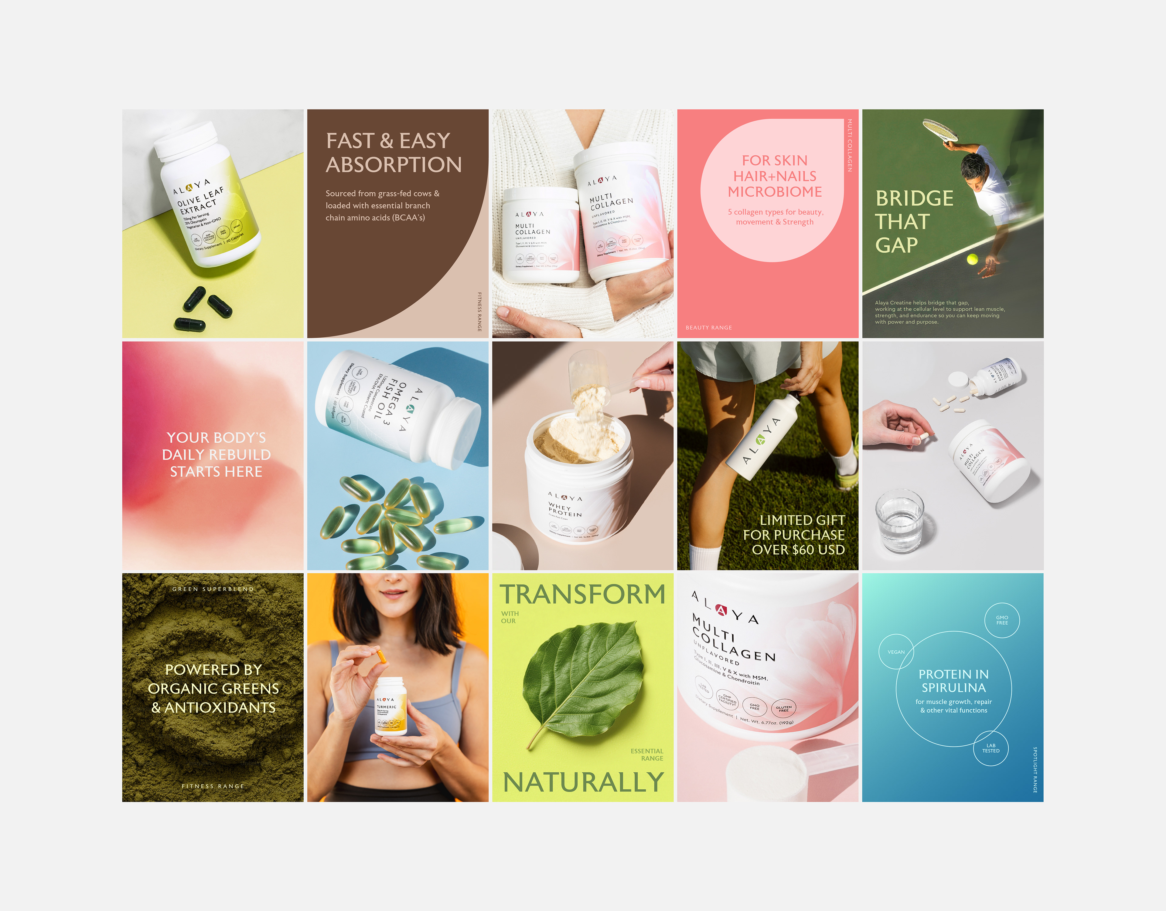
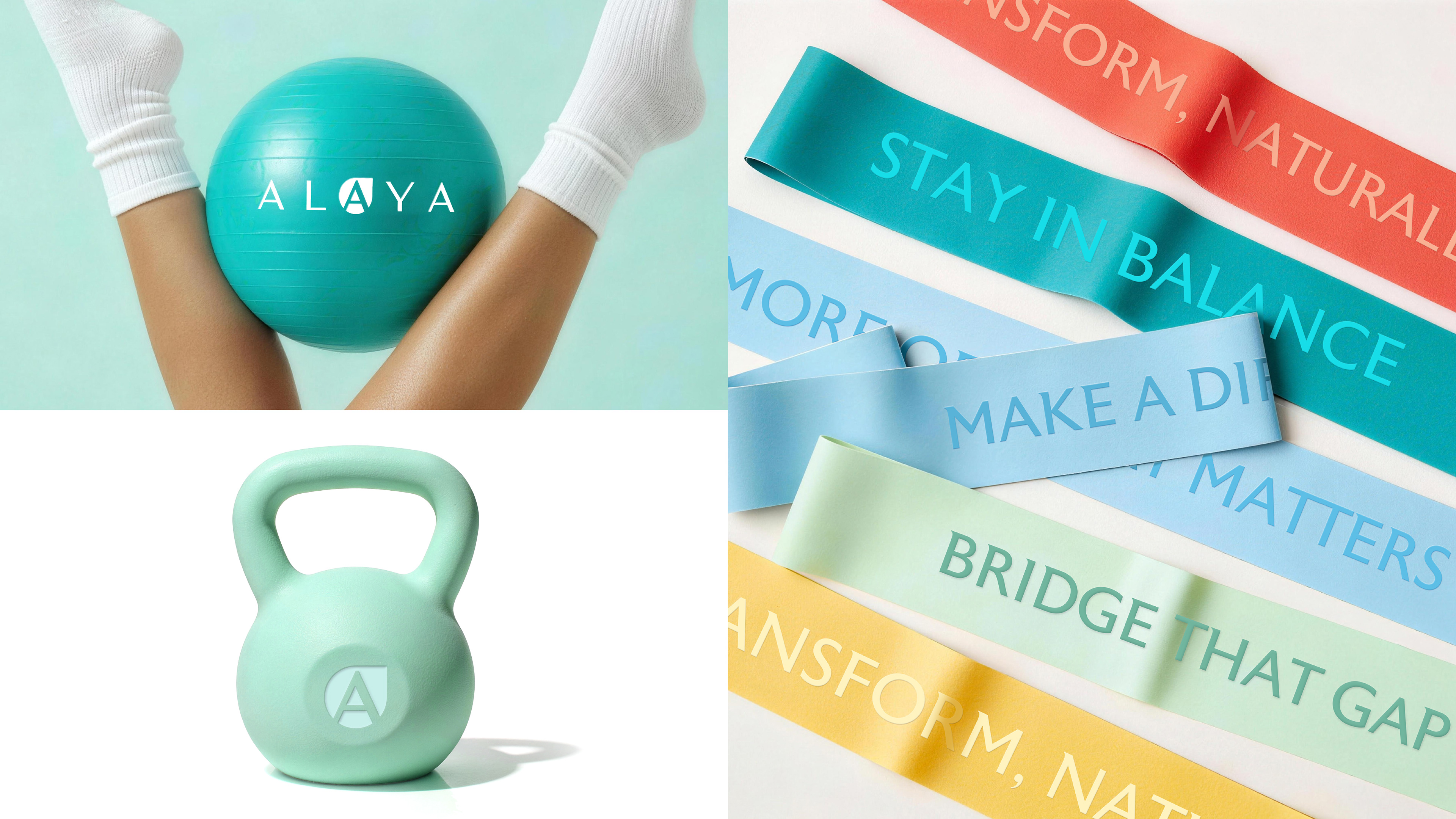
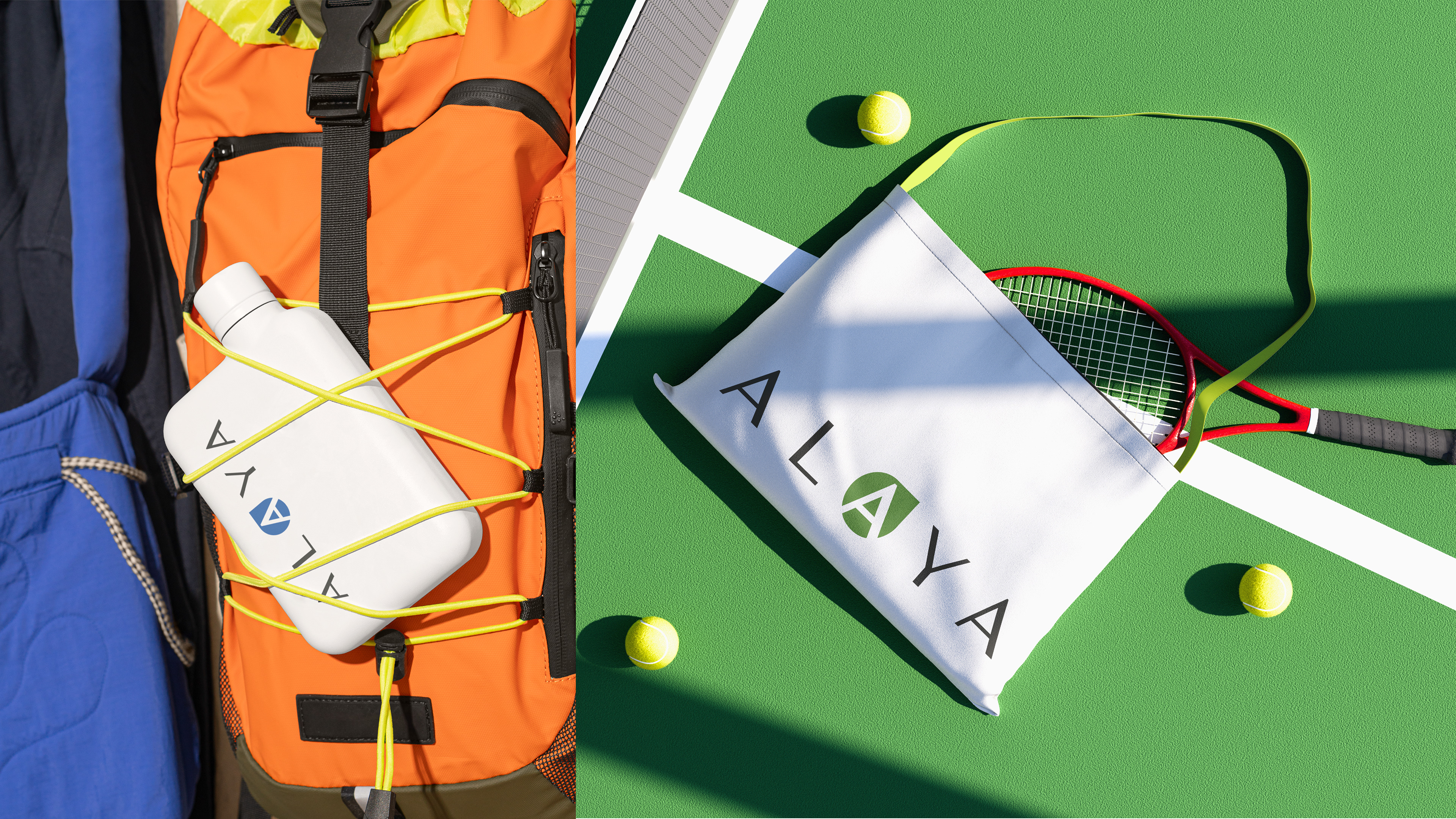
On marketing and digital applications, the language becomes more dynamic. The look and feel remain clean and considered, while expressing energy, intelligence, and momentum. This balance reinforces Alaya as a smart, modern choice without sacrificing authority.
Design elements work together with intent. Fine circular line devices structure information and guide focus. Natural curves lifted from the logo introduce flow and continuity. Vibrant solid colour backgrounds inject vitality and contrast. Dynamic photography adds movement and immediacy.
Together, these elements ensure the brand feels youthful and energetic, yet still grounded in science, quality, and purpose.
Thank you for viewing. Please DO NOT repost without permission.
Alaya Naturals © 2026 Meng Zhang All Rights Reserved